I came across a little quote by Alan Ross this week that I'd like to share. Ross was Ansel Adams' assistant for a time, and the quote addresses a point I've spoken to before, namely that we don't make great work all the time, no matter how wonderful a photographer we are. I think it's a lovely little revelation and well put:
The perfect is the enemy of the good
Film rocks!
One of the joys of looking carefully at the medium of photography is seeing things you didn’t expect. Working on setting up my Pebble Project (see previous post), I was all geared up to compare film and developer combinations, when I noticed this.
Before making my film shots of my pebble studio still life, I made some digital ones to conveniently test the light, composition and exposure. I duly imported the raw file into Lightroom, along with the film scans that are the focus of the exercise. I made a quick print of the FP4+ in LC29 exposure, as a reference shot for the ones that would follow.
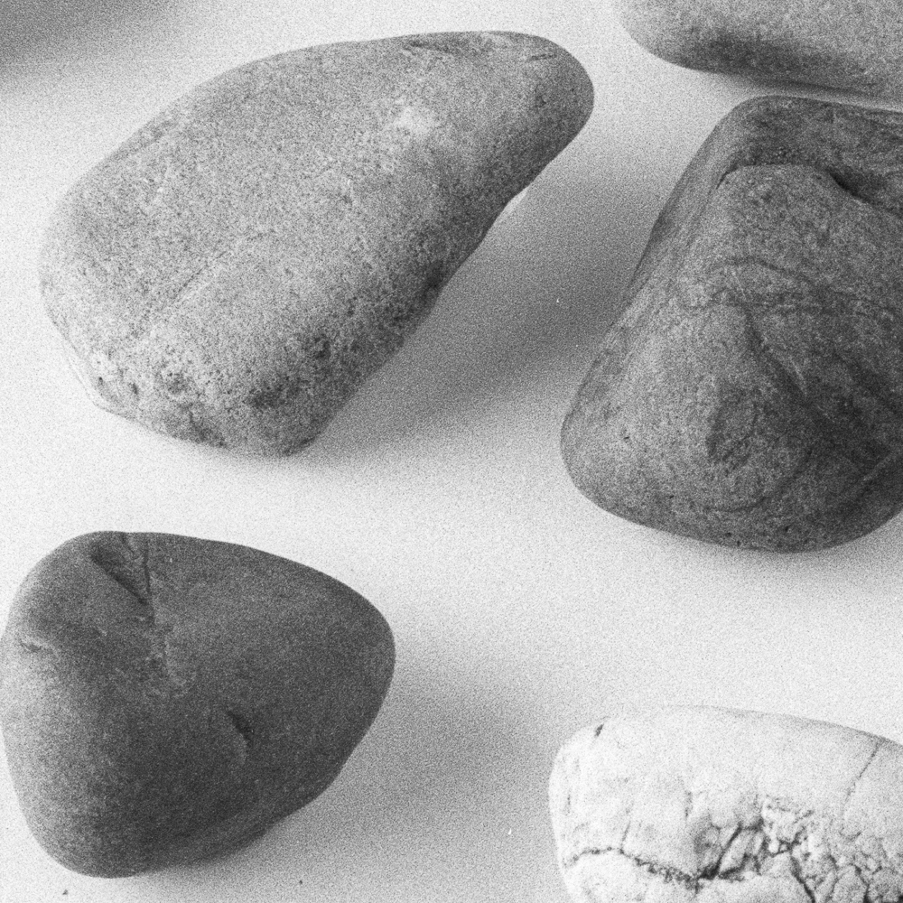
Accept that I hadn’t. It was actually a print of the raw file (with ‘auto’ applied in the develop module). So I went back to atone for my error, and printed the FP4+ frame. Wow, what a difference!
The phrase that springs to mind is ‘descriptive power’. This is what the film frame has over the digital one. There is a depth and presence that is simply absent from the digital capture. The grain is clearly present, but adds a striking sense of detail and sharpness (this I should expect of course).
Now, this isn’t quite a fair comparison, because a raw digital capture needs to be nurtured and carefully processed. I am not in the business of claiming that film is ‘better’ than digital (or vice versa, for that matter). They are different media, with different strengths. Yet there is no escaping the special quality that film imparts. Nothing wrong with noticing - and celebrating - that.
Film rocks. (Pebbles - I know. The pun was unintended!)
Be a better photographer - all ten posts in one place
Missed any of my 'be a better photographer' series? Here's a handy link to all ten posts.
New blog series: Pebble Project
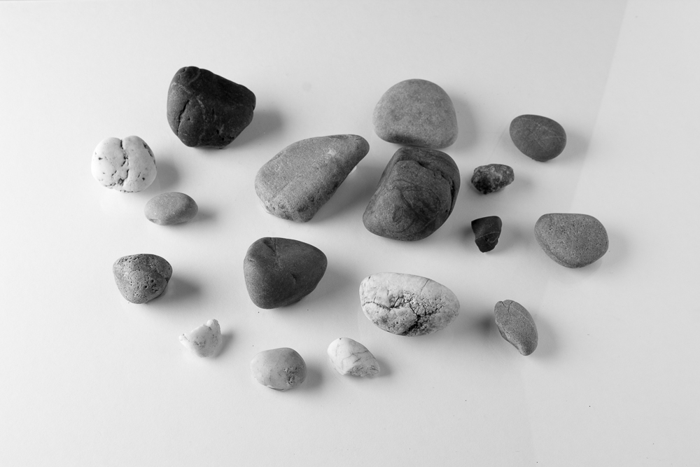
I begin to today with a comparison of two film shots.
Both shots are on Ilford’s FP4+ film. The first is developed in Ilfotec LC29; the second Perceptol, a developer that begins life as a powder. The studio setups were identical in each, at least as far as I could make them. The stones are stuck to a sheet of perspex, making the exercise potentially repeatable.
I have some observations, although these alone aren’t the purpose of this post, as I shall elaborate in a moment. Frankly, I expected the tones of Perceptol to be more different from LC29 than they are. Personally (and subjectively), I see this as ‘win’ for LC29, as Perceptol is a personal favourite and in my mental map of film tonally very distinct. (I should really say, for completeness, that this notion is actually built on my use of HP5+ film.) I can see that the grain is pushed back in the Perceptol version. Grain is still there, but it is very smooth. The highlights are a tiny bit ‘longer’ in the Perceptol version, at least to my eye. Naturally, as I provide images, the reader is invited to make his or her own conclusions.
Now, notwithstanding the special alchemy that happens when different photographers put the same films (and developer) to use in differing circumstances, thus leading to unfathomably different results (and this is a huge factor), I think the idea of trialling different film and developer combinations in a (sort of) standardised setup* has intriguing potential, and, furthermore, may be of genuine use to a film-using community. Maybe this is the geek and obsessive in me rather than the artist, but my mind races with what I might learn as I compare films in this way. How might Delta 100 compare to FP4+ in LC29 (some of you could make a good guess, I’m sure)? In Perceptol, to itself in LC29 and FP4+? What about HP5+? Or DD-X?
You will see where I am going with this. As I’m keen to reiterate, you won’t necessarily get the same results as me; yet with my standardised pebble shot, some legitimate practical comparisons can still be made. I think this could be good knowledge to take into the field. I could spend a long time shooting different films and subjects without being able to make such sound comparisons.
So I end with a modest plan. I will run this as a series of occasional blog postings reporting on different films and developers. If the results build up as I anticipate they will, I should get to a position where I can share an additional summary post (or even article). I envisage maybe four weeks between postings, to give me time to produce the results and write short instalments, although due to my other commitments this may vary somewhat. Feel free to comment or email me with your thoughts (see the ‘contact’ link above), or you can contact me through Twitter (@richard_pickup).
*A brief note on the method behind the samples, and a caveat.
The studio setup is identical in each shot (position of light, light power setting, reflector placement, tripod position). The same camera and lens have been used, along with the same exposure settings. The chosen focus point on the pebbles is the same. Due to the time between the shots (and the necessary time between any shots I may make for the series in future), the framing of the pebbles varied slightly. After processing the film to the times and temperatures stated, both negatives were scanned on a dedicated Nikon film scanner and imported into Lightroom. I made no adjustments to exposure, nor did I sharpen the images. Images were cropped for neatness.
I think it’s worth making this declaration, because with such tests anomalies creep in, and one has to be aware of possible variables. For instance, focussing is prone to small differences and may impact on perceptions of sharpness. Who is to say that the camera was not subject to small vibrations in one of the shots. (Naturally, I’ve been very careful, but we should not entirely rule such things out.) Any conclusions drawn should therefore be taken with a small pinch of salt. As I say above, they should have useful validity but they shouldn’t be taken as gospel. I’ve done these tests in my spare time, out of curiosity and in the spirit of exploration.
Thanks must go to Jevon Tooth for the idea using a collection of stones in a test shot of film tonality.
Barber Barber, Birmingham
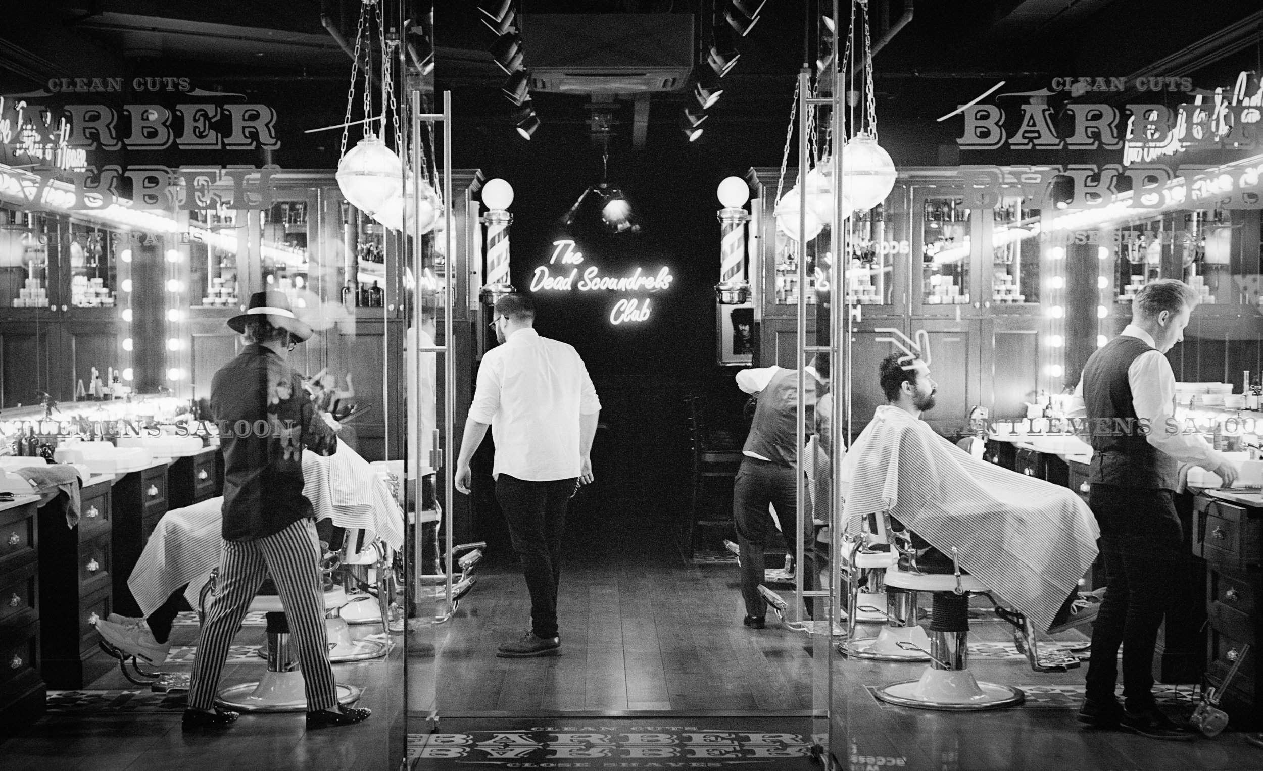
Sometimes a street photography scene comes to you. That was certainly the case here, as I walked past Barber Barber for the first time. This impressive establishment is located in the new Grand Central complex in Birmingham, and is positively baroque in visual features, not least the colourful atire of the staff (or 'scoundrels', as I believe they are called). The whole thing is patently designed to be looked at, with wall to floor glass to the front.
I double-backed, spent a moment or two framing, and waited for the figures to fill the spaces in a pleasing and dynamic way. I knew the lighting and visual interest would work well in black and white. A case of right film, right camera, right place.
What's special about a film portrait?
The other day I came across a photographer wrestling with the task of capturing his daughter on large format film. He declared, with some modesty given the skill he showed in his images, his attempts a failure. I got the sense he would triumph, however, his declaration being at any rate interim in nature.
Large format photographers are not strangers to difficulty (their medium certainly brings its challenges) nor are they afraid to pursue highly individual whims and visions. It would be easy to dismiss this gentleman as a maverick, and to retire with a sigh, saying something like ‘wrong kit friend, try 35mm and continuous focus for better results’.
Yet an essential part of this photographer’s vision, the look he desires, is 5x4 film. It is a very particular look. And film. Something I fully appreciate in the endeavour is the idea of committing a person’s, nay a loved one’s, visage to film.
So in mulling this over, I set myself the task of expressing what exactly it is that makes a film portrait special. The obvious comparison is with digital, so why choose film instead? The answer I have so far come up with may be no more than a kind of illusion, a piece of analogue nostalgia in an increasingly digital time, a fool’s gold of image making.
When I think of my own film portraits, I think of the silver gelatin crystals in the negative that have reacted to the light that emanated from the subject. Physical stuff, now tiny grains, that make up an image. A person, etched in a transparent medium that becomes, through the further action of light, a physical photograph to hold in wonderment. When the negative (or the photograph) is in my hand, I hold a token of a causal connection to the being who was once before the camera. I believe semiologists call this kind of relationship between sign and thing represented ‘indexical’. Like footprints in the snow signalling someone’s presence.
Now, digital is of course no less physical than film, hence my talk of fool’s gold. Yet the physicality of digital is, well, just not very physical. Many others have pointed out that images on memory cards and folders on computers are ephemeral. Negatives and prints, by contrast, support the romance of the imagined connection to a person that a portrait fosters. Like a Proustian smell, they are evocative and sensory, and nurture memories. The negative in my fingers is like a little light trap; a special light that really came, indexically, from the person caught within.
My ruminations don’t address the ‘look’ of film as a factor, but I think this isn’t the best place to look for distinctions, at least not on its own. I use and enjoy film simulation presets on my digital shots. These go a long way to imitating film (although not the whole way, for further technical reasons involving focal lengths and formats, old lenses and so on). It is not (just) the look of film that makes it special. It is that and the gravitas of the physical light trap of which I write. Digital pictures image people; film ones bear their imprint.
The Emulsive Ilford community interview
Purveyors of photographic materials Ilford really need no introduction. Their name already permeates this blog. They are rightly known for the quality and consistency of their products, and many a photographer and darkroom worker relies on them.
In May, Emulsive (a website dedicated to film) invited questions via social media to put to this great company. Ilford have been generous in the time and consideration given to their response, and they answered an impressive number of questions. Click on the button below for the link. It makes good reading for anyone interested in the UK photo industry, and especially the future of film.
Be a better photographer - a postscript
So, today I have posted the tenth, and final, instalment of my little weekly mini series of photography tips. Writing them has been enjoyable, and I have learnt about myself as a photographer and potential blogger.
My website is not very old, and while I can monitor visitor numbers to some degree, and have linked to social media, it is not easy to tell how my writing has been received (or how many readers it has had). I suspect the lot of the blogger is fundamentally a lonely one, especially in the early stages of a blog’s life. Perhaps the game is changing too: maybe the blogs with large audiences were formed when such things were possible, but now a proliferation of blogs means a smaller and more specialised audience for each new one.
A writer is naught without an audience, and so for this reason I invite feedback on the ‘better photographer’ series, or any other posts for that matter. The contact link in the menu above is an easy way to get in touch, or there are sections for comments under specific posts. The latter are moderated and so there may be a short delay before they appear.
Some useful questions are: Which bits did you like? How did you find the format, the length, flavour? Are there things I didn’t cover that you would like to see? Were the tips helpful? Do you want more? Would you like to see some beginners introductions to photo topics? If so, which ones?
The content of such a website is always going to be the responsibility of the owner, and of course I reserve the right to make it indelibly mine (it wouldn’t be Richard Pickup Photography else, and I have only begun to scratch the surface of what I have to offer). I plan to address darkroom more than I have to date, and certainly more on digital inkjet printing. Modest reviews of equipment and papers will continue.
At the same time it is abundantly clear from my experience with social media that collaborative and community based dialogue is on the rise (this may link to my suspicion of more numerous, but more specialised photography sites). I welcome this social aspect, and thus if you wish to stick around and get involved, you have an opportunity to shape what I do. I hope, then, that an audience and indeed a community, with you a part of it, will emerge. If you think my content is for you, please do follow and voice your opinion.
Be a better photographer - tip 10
Train your visual memory
I believe in creativity, but I also believe that we learn a social language ‘through’ which we speak. As it is with words, so it is with photography. Adams puts it economically when he says that ‘you bring to the act of photography all the pictures you have seen’. Photographers learn photography by learning to speak its language. That language is made up of the work that has gone before us, the grammar, so to write, established by those who find their way into a culture’s visual memory, passed on through books, museums and latterly the web.
Just as a writer might conjure an original feeling or sentiment using the established words, phrases and literary devices of the past, so a photographer aims to carve out a niche in picture-making. Literary minds are nourished by the traditions of literature on which they draw and are immersed. The same goes for photographers. I am not so much of an expressionist as Adams, and maybe the full quote above is unfashionably romantic. However, I think we would not be off the mark to read Adams’ as an educational message to look carefully and widely at good work by others, in order to improve our practice.
So my tip for the day is to consider the wonderful photography of the past as great works that we can read to improve our photographic eye. If you have seen good photos, in other words, you will stand a better chance of drawing on them to make good work. Give time and space in your engagement with photography over to careful looking and contemplation. Galleries and museums are great because we are in the physical company of the work and peruse with minimal distraction. Books are tactile and inhabit our living environments, such that we spend more time digesting a photographer’s oeuvre. Numerous times have I chanced on a photographers monograph from my bookshelf and re-awakened my engagement with the work. Such images stick around, literally and in the mind.
Sure, we might start off being under the spell of great photos, feeling like we’ve made another ‘Adams’, say. Yet given enough time and a generous diet, we might come to put that ‘language’ together, in fresh and contemporary ways. It’s an essential part of learning to be a better photographer.
Artisan and Artist camera straps
Many of the best accessories are simple, aesthetically pleasing and eminently practical. Artisan and Artist camera straps fall into this category. They are handmade from quality materials, and are both beautiful (well, to my eye) and work well.
They are not cheap (should we expect a high quality, handmade item to be so?), and have a somewhat austere simplicity that some might find off-putting. In this latter regard, they fit into a tradition of simple, ‘form follows function’ design, and perhaps for this reason are often associated with rangefinder aficionados.
For my own cameras, I have presently opted for an adjustable model, which allows the user to determine the precise location of the camera on the belly / chest when the strap is around the neck. They offer non-adjustable versions too, for those who are happy with the length on offer (it depends on your size and physique of course), which again derives from simple designs past (notably the bundled film Leica M strap, with its formidable spiked rubber neck pad). There is the bonus of a little more economy to the non-adjustable version.
Personally, I find my A&A straps very comfortable. So much so that I hardly notice wearing my, admittedly smallish, cameras. The straps are not especially wide, but there is just enough width to make them an effective upgrade from thin nylon straps. The material is wonderfully soft, and in that regard feels very luxurious. They are finished with hand stitching, which I find attractive to look at, and a beautiful printed logo.
I am unable to comment on the hardiness of the straps because I have only owned mine for about a year and a half. Suffice it to say, they haven’t aged very much and fill me with confidence that they will last a great deal longer (probably a good few years). The leather and ringlet system at the ends works fine with my cameras, although it is certainly a little tight on my Sony A7II. This may be a consideration depending on the position of the lugs on your camera, but I doubt it’s of too much concern.
If you are looking for a little luxury and practical excellence in an accessory for you camera, look no further than an A&A strap.
Be a better photographer - tip 9
How to make interesting photographs
My tip today is to photograph what you find interesting, in order to make interesting photographs.
Some of my tips in this series have bordered on stating the obvious, I know, but sometimes there is wisdom in a truism. This tip is no different. There is so much to occupy us in photography, from equipment to light, to compositions and processing, that it is easy to forget that we will love a photograph to the degree in which we love the subject. Sally Mann has said something to the effect that you should photograph what you love in order to make great art.
So in my customary manner I ask you a question: do you love - find interesting - what’s in your photos? Have another looks at your images. Maybe this applies to some and not others. Are you even photographing what you love at all? (When we become enamoured with gear we often forget the simple practicalities of using it. We might, for example, pursue equipment to make landscapes, because we dream of making landscapes; but in actual fact have neither the time nor opportunity to make such work).
I cannot tell you what you love. It might be cars, buildings, people, places, little details in everyday life (or, following from the modernists, the medium itself). Herein lies the subjectivity in this, and the very good reason we make work with an audience in mind. Photography is powerfully and fundamentally tied to the thing in the image.
Take the time to ask whether you still love the thing in front of your lens, and you will go a long way to retaining the spark of your own interest in what you do.
Passageway, Menorca
A by-product of writing a blog is that it inevitably records the author's developing tastes and predilections. I seem to be very much in a black and white mindset at the moment, to the point, even, of giving a monochrome treatment to shots I originally saw in colour - like this one here.
There is a very old tradition in picture making of a landscape in which the viewer's eye is led towards a source of light. This has a pictorial effectiveness, the eye undertaking a 'journey' and finding satisfaction in so doing, and it also has an obvious metaphorical resonance. 'Out of the darkness, and into the light.' I write 'picture making', because it abounds in historical painting, and therefore long precedes photography.
I am close to this shot, having just processed it, and so am not yet decided as to how much I like it. It is significant because of its relationship with the above tradition, but as usual with these things, it is also something of a photographer's set piece, just as are windows, doors and so on. My main reason for including it is that I know I am happy with its tones.
I trimmed the image a little, before darkening the edges and tweaking the highlight tones. I worked towards a tonally full piece, one having a range of tones from black to near white. This image presents one of those very balanced and full-looking histograms that fills the graph as a neat and symmetrical, centred hill. I haven't yet printed it, but imagine that it will print very well and has plenty to occupy the eye, in textural detail as well as fulsome tone.
Be a better photographer - tip 8
Find the street scene, then wait for actors
In a great deal of the best street photography work there is a special relationship between the setting and the people in it. We often find ourselves marvelling at these shots because not only is the composition elegant and convincing, but there is a person in ‘just the right’ place in the frame. There is a coming together of setting and event, and in the very best this carries the extra weight of a poignant meaning as setting and actor(s) create a frisson. Henri Cartier-Bresson is one such master of this technique.
There is a simple technique you can use to make this happen in your shots (not that I’m promising you’ll immediately become a Cartier-Bresson). You simply find a setting you like, paying attention to composition and the shapes in the frame, and wait for somebody to arrive, in the right place.
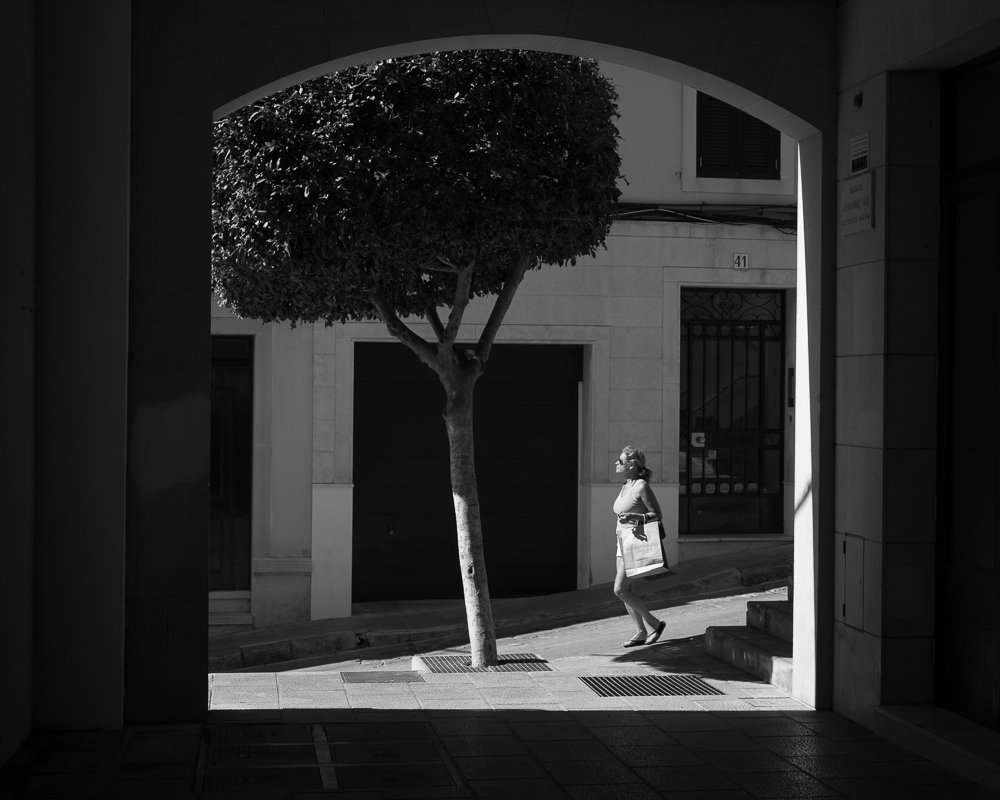
In the image above, I was struck by the scene and the view through the opening (the slanting tree caught my eye), long before anybody arrived. I realised I could use this technique and wait for somebody to walk into the frame. It took several attempts to get somebody in the right position, and the right somebody, posture particularly, at that. I enjoy the way the woman’s leaning stride echoes the leaning tree. This elevates the shot from a view that catches the eye to something more.
A great technique if you’re into street photography.
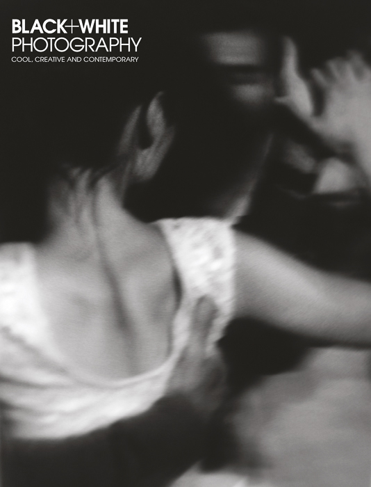
Black and White Photography magazine
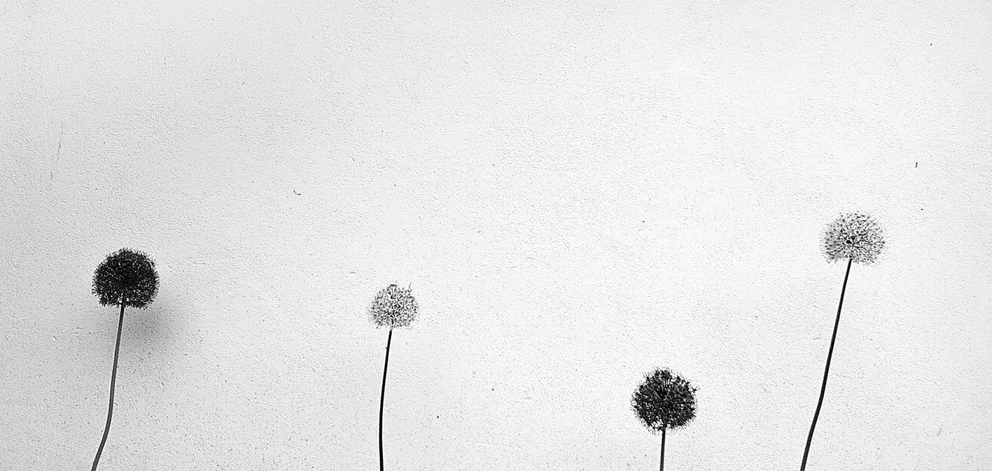
A few posts back I shared a smartphone image of some alliums against a white wall. I'm pleased to say this image has been published in Black and White Photography magazine, as part of their 'Smartshots' feature.
If you don't already know it, this is certainly a publication to check out. Highlights this month include work by Stephen Shore and Nick Brandt, as well as lots of inspirational images and advice. While the magazine doesn't exactly have a house style, there is a unifying elegance to the work, and the quality of the reproductions is very fine. The emphasis is on artistic photography (of the black and white kind, naturally) rather than equipment or industry issues. I also enjoy that the images are subtly toned, which creates a visual variety, even in black and white.
Darkroom prints from digital negatives
What follows is a little report on some work I have been doing with digital negatives. It is relatively specialised ground, especially as it entails access to a good inkjet printer, editing software, and a darkroom, but I think it will be of interest to anyone intrigued by the thought of a marriage of digital and darkroom.
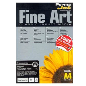
The story starts with an excellent product by Permajet called Digital Negative Transfer Film. This is the material on which the technique rests and its ready availability and quality is of crucial importance. This is not a technique you will wish to spend time on if it turns out you can no longer get the essential media, or indeed if that media fails you. A wise master printer once said that it is your time, not materials, that are your biggest outlay. I personally am not prepared to invest time in a process that I am unlikely to be able to repeat, unless I can value the occasion as a one-off simply so to be enjoyed.
In this sense, what I offer is a little review, too, of Permajet’s film. I am happy to say that it passes muster, and I am confident that I can use the process much more, and to fuller effect.
Ever since I heard about high quality digital film, I have wondered whether I could make a negative from a digital file that I could print on darkroom paper. Readers familiar with platinum / palladium printing (and indeed other alternative processes involving a digital negative) will be aware that a tradition of using such materials has existed for some time. Processes like cyanotype or platinum entail the creation of the photographic medium (paper) prior to exposure, whereas printing with conventional darkroom papers offers a little more speed and convenience.
The motivation for making a digital negative to print in the darkroom is that one can have the detail, sharpness and control of a digital file combined with the unique tones of a silver print. I have long thought that what makes darkroom prints so special is that we are looking upon a physical manifestation of silver in a print. The process is based on a contact print method of printing, not unlike that used by large format photographers who print directly from, say, 10x8 inch negatives. There is no enlarger lens mediating the light and so all the glorious detail of the original negative is preserved (you may have seen this in 35mm when enlarging your negatives, the contact print creating an unobtainable, crisp rendition of the original negative).
I have written before that I consider the controls offered by darkroom to be more than adequate on their own (as supported by the many fabulous prints made throughout darkroom’s history). However, it is inescapably true that when you can work on a digital negative first, you have all the controls of the digital darkroom at your disposal in addition to those under the safelights. This inevitably brings its complications (and as you will see adds to steps to be taken) but the precision and creative possibilities open to the printer are mind boggling.
The first step is to establish a minimum exposure time for your paper that will yield a black tone. You can do this with a simple test strip, as you would when testing for negative exposure times. My paper of choice was Ilford’s fine Multigrade Warmtone Glossy. My rationale was that, as well as the fact that I enjoy its tonality, I could process, wash and dry it without the restrictions of fibre based paper.
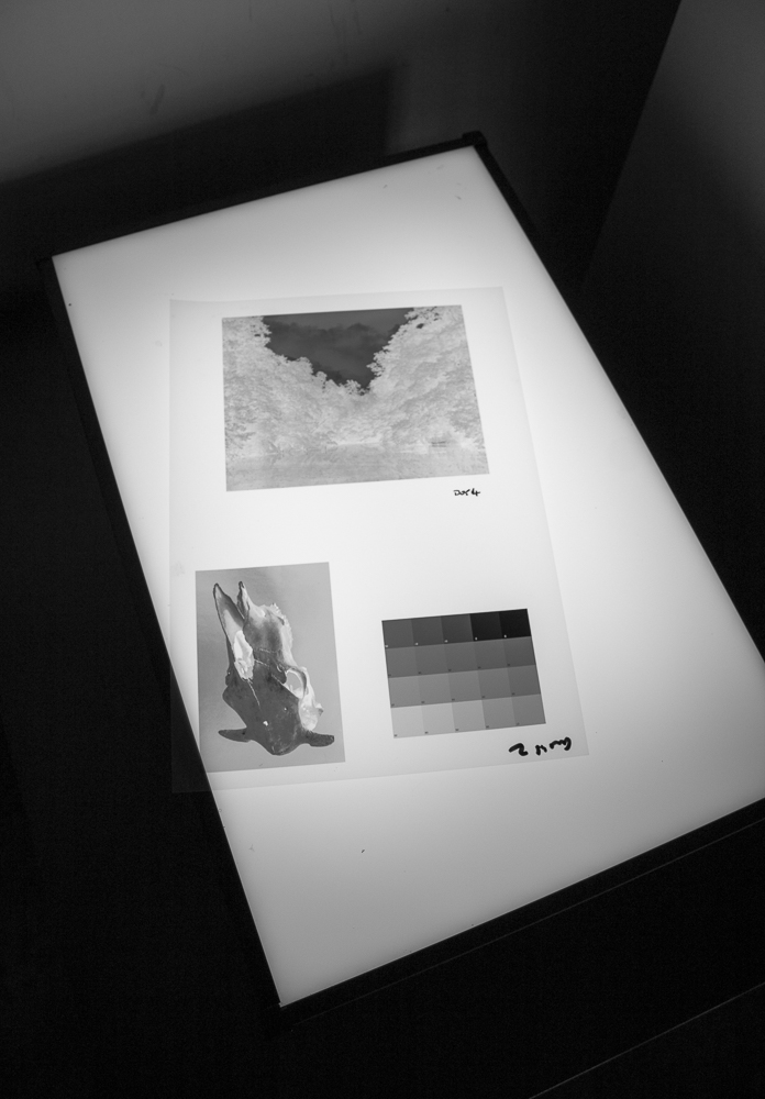
You next print a step wedge showing a range of tones onto the digital film. These can be found for download on the internet, and are simply a range of different densities of tone running from ‘0’ (white) to ‘100’ (black). I printed mine using Epson's Advanced Black and White driver, through Lightroom.
The step wedge is taken into the darkroom and contact-printed at the minimum exposure time for black established in step one. When I exposed the step wedge, I made sure I covered a small section of the paper with opaque card. This creates a reference point representing unexposed paper, or paper white. The resulting print is then dried properly (this must be done to allow for ‘dry down’ of your print tones) and scanned at 300 ppi. I next opened this file in Photoshop, converted it to greyscale, and opened the levels adjustment. I sampled the black and white points to shift the curve so that ‘pure’ black and white are represented. This step is necessary, because we are now creating a model of the darkroom print in, as it were, a virtual space. The white reading is taken from the area of the print that was covered during darkroom exposure, the black from the 100% black section.
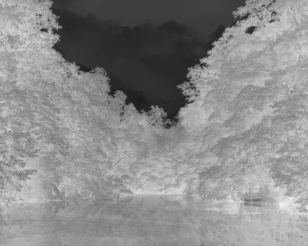
Now comes what is most difficult part. A curve must be constructed to ‘correct’ a processed digital file so that it will print correctly on darkroom paper. You could of course simply invert one such file, print it onto the film and contact print it. I’d almost encourage you to do that, because you will see the distance between digital film and a film negative. It should look pretty horrible tonally, with a whole raft of tones missing.
So what we do is read the tones from the scanned step wedge at intervals of ten to ascertain how our correction will go. This is done using the eyedropper tool in Photoshop. My numbers went 0-4, 5-4, 10-7. 20-14, 30-24, 40-37 and so on. I then built a correction curve by reversing the inputs and outputs and doing a little judging by eye. I looked at numerous accounts of how to do this online and they all yielded slightly different results. I don’t think you can get away from guesswork here. This is alchemy, and labour. You then print your curve-corrected step wedge in the hope that the tones more closely match a healthy, well spaced, sequence of tones. I printed a sample image at the same time because the tonal ‘rightness’ of images is much easier to judge. Again, however, hard work was involved because that meant applying the speculative curve to the image as well as the step wedge! You have to enjoy repetitive processes and the splendid isolation of the darkroom for this work.
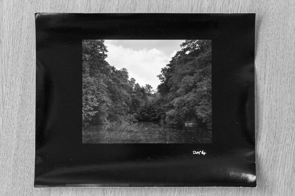
You will now appreciate why I experimented with the process over a period of several weeks. I had a lot of disappointments along the way, and had to look upon a lot of truly nasty looking renditions of my test image. Then, suddenly, I had it. D054 was the unglamorous name of the negative, and it printed pleasantly enough at grade 2.5. I increased the grade slightly and felt I had reached my goal: a file processed with care and accuracy digitally, with fine sharpness and ‘bite’, that I could print with confidence and precision onto beautiful darkroom paper. D054 was 6x5 or so inches, yet I knew I could go back and make a 10x8 negative if I so wished. A 10x8 negative that would require no dodging and burning (because that was done to the original file) and could be re-made at the touch of a button if it got damaged. Phew!
In subsequent work I made a fibre-based warmtone print using the sibling paper from Ilford. I made a small adjustment to the grade, and to my eye the print took on that ‘something extra’ that fibre paper so often bestows. This is the stage that I am at now. I intend to do some more printing using the same curve I developed for this first image, but it is my understanding that subsequent images may require bespoke curves (which in turn may require some iterative testing). I also intend to explore larger negatives and therefore prints. Permajet offers the film in A3 (as well as larger sizes in rolls), which will accommodate this. The possibilities are therefore very exciting, if the work time consuming and demanding, as I have emphasised.
Others have observed that one consequence of digital technology is that we live in an unprecedented era of available technology. For those who are willing to look, not only has darkroom not gone away, but it now sits alongside developing media, opening up opportunities for those who can and do seek them. Exciting times indeed.
Be a better photographer - tip 7
Keep on photographing in your mind
Today’s tip is to practise taking pictures all the time, even when you don’t have a camera with you. You can go through much of the process in your mind, thus sharpening your skills of seeing.
Ask yourself some questions as you go. What is the subject? Where does it start and end? Where are the edges of the frame? Do you need to be closer (or further away)? Do you need to change your perspective by crouching down, or getting higher? Is the image you see black and white or colour?
If the ‘shot’ is particularly memorable, you may want to take things a little further. Can you imagine how it would be processed? How would you make the print? What size should it be? How might it be presented?
Reference print special offer
While there is a lot of fine work out there, acquiring prints is often an expensive business. As I have written before, I think it's really important for photographers to study example prints by established practitioners to calibrate their own printing. How can you print well if you don't know what a good print looks like?
To this end, I am offering my own affordable reference print. In this case, it is a black and white pigment inkjet print on superb Canson Baryta Photographique paper. It is printed on a state of the art Epson P600 printer (this is significant because Epson have improved the depth of the blacks). It is a 'full bodied' (moderately high contrast) image, with a full range of tones. You can see this to some extent in the image above: there is no shortage of deep blacks and crisp highlights, but also there is a range of subtle greys in between.
I won't sign and date this print as per my usual practice (to distinguish it from my fine art prints) but I will caption it with some essential technical information. Postage to the UK is free, with a modest postage charge to the rest of the world. I am essentially trying to cover costs and a little of my time.
You can find the print here:
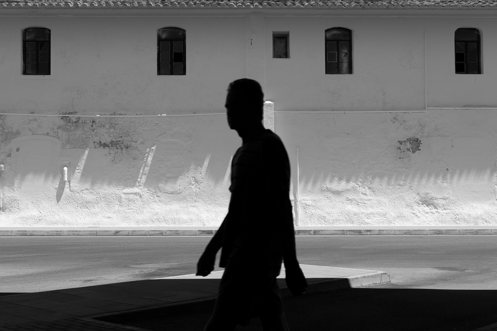
Silhouette and Windows
Be a better photographer - tip 6
Buy a trip, not more gear
Should I buy more gear (probably a camera or lens) or a trip to a far-flung location? I remember pondering this once myself, and have recently been asked the question by another photographer.
There is a malady amongst photographers affectionately known as GAS, or Gear Acquisition Syndrome. Photographers, especially amateurs it seems, are inveterate shoppers. You can see the logic in this: if I don’t have a 24mm lens, pictures with a 24mm field of view I will not make. The tendrils of consumerism do their dark work, and gear research and online shopping are a fact of our photographic lives.
I will simply answer that when I plumped for far-flung location (India, actually) over the camera I was pondering, my decision proved to be a sound one. Looking back, the best possible one. Suffice it to say, I made some of my best work on that trip and cannot now conceive of trading the experience - and the shaking up of my photographic vision it provided - for a camera I may, or may not have needed, that I certainly wouldn’t have ever used in India.