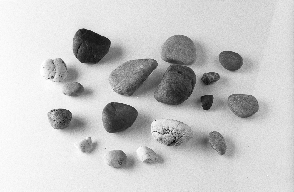
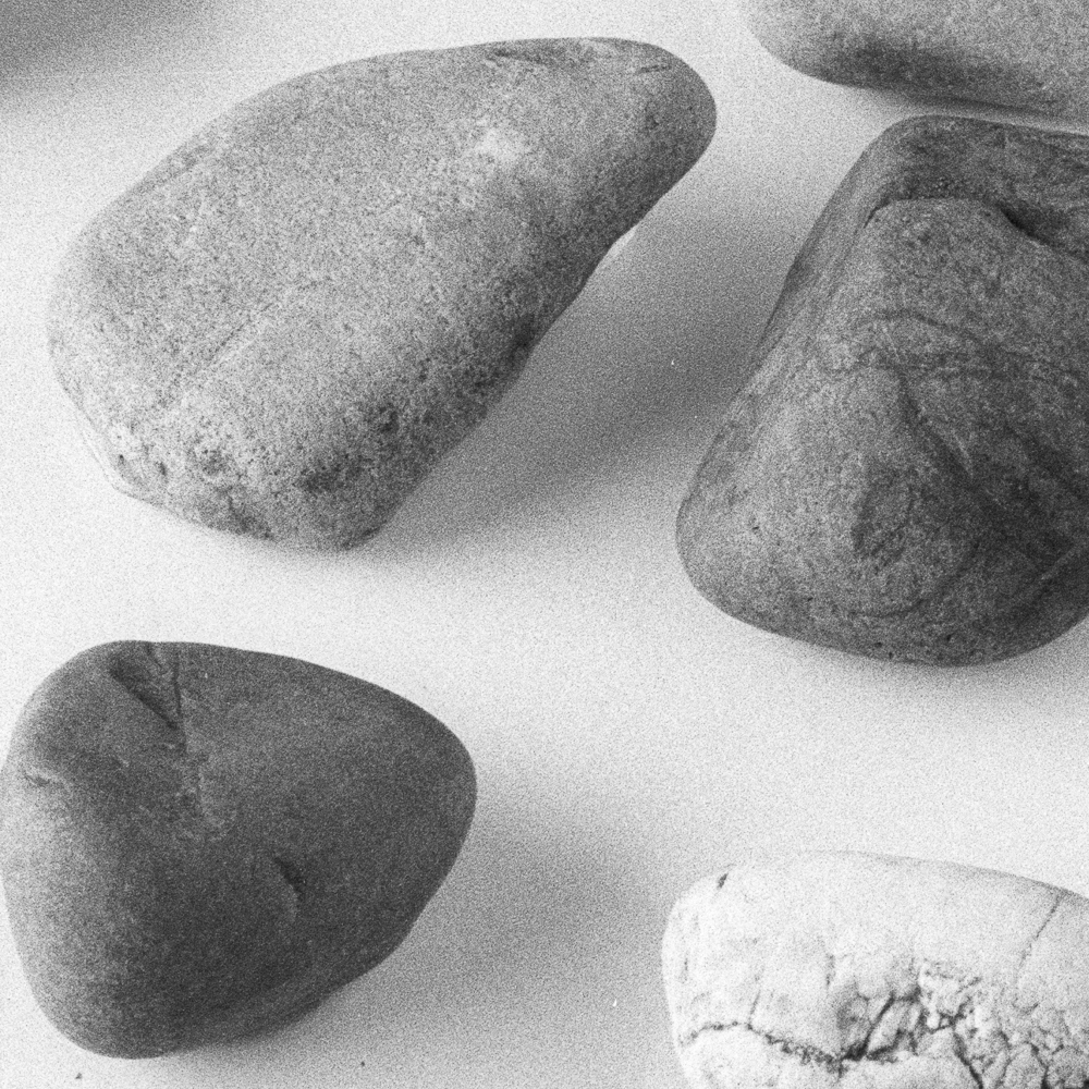
Another sample is added to the Pebble Project Galleries. This time it's the turn of Ilfotec HC, used on FP4+. Looks to have a nice open tonality, holding the highlights well. Grain is quite evident, but sharpness is not lacking either.
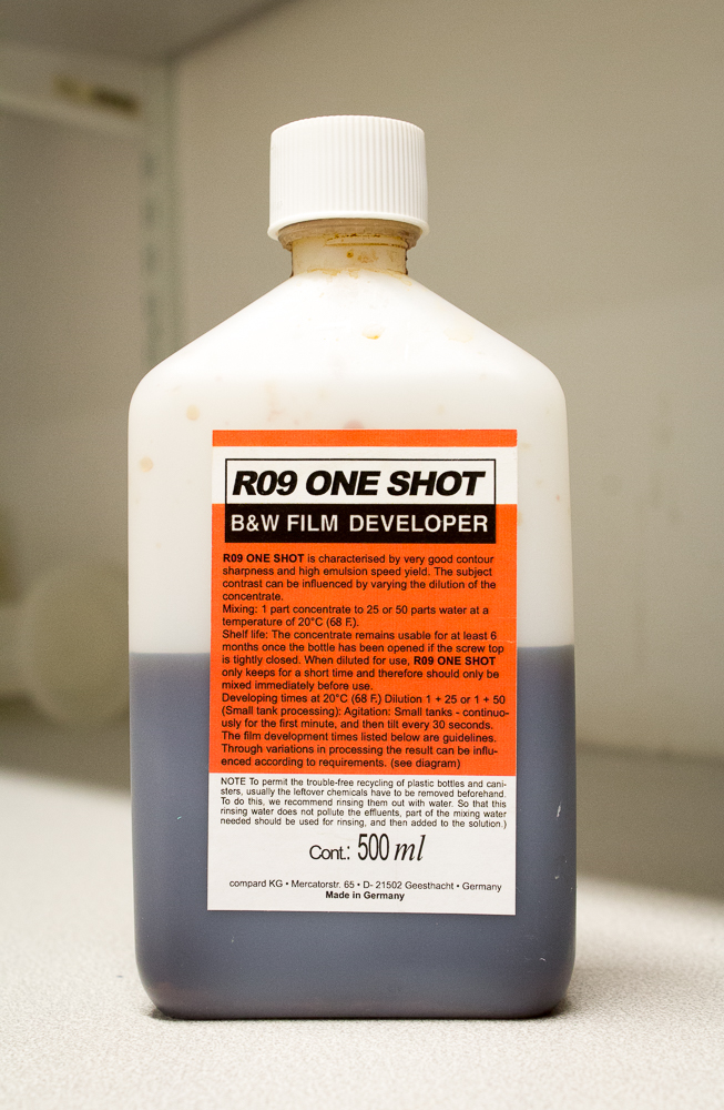
Pebbles in R09
A bottle sits on the film developing worktop. A treacle-brown liquid meets an equal quantity of air in the container, and, as film developers go, it looks to be in a sorry state. Air = oxidation = spent developer, right? In film developing terms this bottle is however half-full, not half empty.
(Please excuse the terrible pun.)
I don't know precisely how old this bottle is. It seems to have escaped my usual practice of labelling with an opening date in marker pen (definitely recommended). Looking at my negative collection, I estimate it was opened in 2013.
R09 - a modern day copy of the famous Rodinal - is liked by many photographers for its tonality. I haven't developed very much with it in comparison to other developers, so I won't make a judgement on this. You will notice the grain in your image with this developer (especially with medium speed and fast films).
It was always purported to have a splendid shelf-life, but today I confirmed that for myself. I present below the latest addition to my Pebble Project, FP4+, developed in the formula in question. I was very pleasantly surprised to see a half-opened bottle of some age produce a perfectly good looking negative. A fresher batch may produce better results (the label on the bottle recommends not exceeding six months when opened).
It looks like I have found a good developer to keep at the back of the cupboard for emergencies.
To access the full gallery so far, go to Resources on the main menu above and select Pebble Project Galleries.
Pebble Project Gallery
The results of my Pebble Project tests to date now have a gallery. You will find it under the 'Resources' section of this site's menu. It puts all the results in one place, and offers both film scans and darkroom prints. You can click on each individual image for a larger version. Any further results that I share in blog posts will be added here too. I hope this will make the gallery a useful resource.
If you have been tuning in to this project, you will notice that I have added some scans and prints of other film and developer combinations. The addition of HP5+ and Delta 100 Professional here suggest the structure of my thinking for films to explore.
If you are mainly interested in the visual aspect of the tests, you may want to head over to the gallery now to take a look. What follows are some technical details and corrections for those interested in such matters, or who want to actively use the recipes explored.
Darkroom Prints
When making the darkroom prints, I was able to standardise at contrast grade 2.5 and aperture f5.6. I used Ilford's Multigrade paper. It was not possible to print every negative for the same time, of course, due to differing exposures and hence negative densities. This then demands a standardisation procedure, and inevitably judgements - my personal judgements - come into play. I decided to print to the first hint of very pale, 'almost white' tone in the central lower small stone. I plan to do some tests with Multigrade Warmtone, which will necessitate changes in exposure times once again due to the different ISO of the paper (roughly half the speed of 'standard' Multigrade).
Adjustments and errors
I came up with quite a list originally with which to offer some interpretations of my first results (grain, midtone contrast, sharpness, and so on). The list itself was good, but I am now a little more philosophical about the comparisons.
Allowing for the fact that these are my results made with my own conditions and equipment (the old zone system caveat of the individual nature of test results), it strikes me now that tonality is the most obvious category of general applicability. The tonal comparisons that the gallery has to offer are broadly good, and I would expect you to get results not unlike mine if you followed the same film and developer recipes.
Making inkjet prints from scans adds variables that are different from darkroom printing variables. Because I am somebody who makes both inkjet and darkroom prints from negatives, I wanted to explore both processes. Comparing darkroom prints to inkjet ones provided an object lesson in the role of the printer drivers and scanner. One could argue that comparisons of grain, sharpness and midtone contrast are still good within, but not across, systems (be it digital setup or darkroom).
I was already aware that exposure variations would impact on tonality. I took the decision to expose the Perceptol samples differently, for example, because it is a speed reducing developer. This is in line with normal exposure practice. Put differently, there is no universal standard of exposure even following ISO in a studio situation. As the zone system teaches, ISO is nothing but a starting point for an individual's exposure value. That said, I exposed the FP4+ sample at 100 ISO, which in box speed terms is a little additional exposure. The Delta 100 sample was similarly exposed at 100, thus making it slightly less exposed by comparison. This can be seen in the negatives. I have ruminated somewhat as to whether to continue to expose Delta 100 at 100, or to give it the extra exposure in line with FP4+.
Lastly, I must declare a good old fashioned mistake. I adjusted aperture in order to change the exposure (as mentioned in the Perceptol sample), but neglected to take this into account when thinking about sharpness and grain. The problem is that, when comparing samples containing aperture and thus exposure differences, you are looking first at differences in aperture, and only second at the role of the developer. Other than making more convoluted adjustments to the lighting strength (and thus introducing a new set of variations), I'm not sure how this can be avoided. Better to look on sharpness differences with this in mind.
New blog series: Pebble Project
I begin to today with a comparison of two film shots.
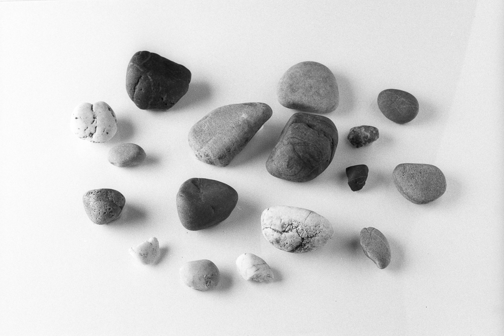
Both shots are on Ilford’s FP4+ film. The first is developed in Ilfotec LC29; the second Perceptol, a developer that begins life as a powder. The studio setups were identical in each, at least as far as I could make them. The stones are stuck to a sheet of perspex, making the exercise potentially repeatable.
I have some observations, although these alone aren’t the purpose of this post, as I shall elaborate in a moment. Frankly, I expected the tones of Perceptol to be more different from LC29 than they are. Personally (and subjectively), I see this as ‘win’ for LC29, as Perceptol is a personal favourite and in my mental map of film tonally very distinct. (I should really say, for completeness, that this notion is actually built on my use of HP5+ film.) I can see that the grain is pushed back in the Perceptol version. Grain is still there, but it is very smooth. The highlights are a tiny bit ‘longer’ in the Perceptol version, at least to my eye. Naturally, as I provide images, the reader is invited to make his or her own conclusions.
Now, notwithstanding the special alchemy that happens when different photographers put the same films (and developer) to use in differing circumstances, thus leading to unfathomably different results (and this is a huge factor), I think the idea of trialling different film and developer combinations in a (sort of) standardised setup* has intriguing potential, and, furthermore, may be of genuine use to a film-using community. Maybe this is the geek and obsessive in me rather than the artist, but my mind races with what I might learn as I compare films in this way. How might Delta 100 compare to FP4+ in LC29 (some of you could make a good guess, I’m sure)? In Perceptol, to itself in LC29 and FP4+? What about HP5+? Or DD-X?
You will see where I am going with this. As I’m keen to reiterate, you won’t necessarily get the same results as me; yet with my standardised pebble shot, some legitimate practical comparisons can still be made. I think this could be good knowledge to take into the field. I could spend a long time shooting different films and subjects without being able to make such sound comparisons.
So I end with a modest plan. I will run this as a series of occasional blog postings reporting on different films and developers. If the results build up as I anticipate they will, I should get to a position where I can share an additional summary post (or even article). I envisage maybe four weeks between postings, to give me time to produce the results and write short instalments, although due to my other commitments this may vary somewhat. Feel free to comment or email me with your thoughts (see the ‘contact’ link above), or you can contact me through Twitter (@richard_pickup).
*A brief note on the method behind the samples, and a caveat.
The studio setup is identical in each shot (position of light, light power setting, reflector placement, tripod position). The same camera and lens have been used, along with the same exposure settings. The chosen focus point on the pebbles is the same. Due to the time between the shots (and the necessary time between any shots I may make for the series in future), the framing of the pebbles varied slightly. After processing the film to the times and temperatures stated, both negatives were scanned on a dedicated Nikon film scanner and imported into Lightroom. I made no adjustments to exposure, nor did I sharpen the images. Images were cropped for neatness.
I think it’s worth making this declaration, because with such tests anomalies creep in, and one has to be aware of possible variables. For instance, focussing is prone to small differences and may impact on perceptions of sharpness. Who is to say that the camera was not subject to small vibrations in one of the shots. (Naturally, I’ve been very careful, but we should not entirely rule such things out.) Any conclusions drawn should therefore be taken with a small pinch of salt. As I say above, they should have useful validity but they shouldn’t be taken as gospel. I’ve done these tests in my spare time, out of curiosity and in the spirit of exploration.
Thanks must go to Jevon Tooth for the idea using a collection of stones in a test shot of film tonality.