The print as taskmaster

Regular readers will know of my regard for printing and the pleasure it potentially brings. Seeing an image move from screen to fine paper can be nothing short of a revelation. New tones, colour relationships and detail are revealed, and there is a strong sense of a veil being pulled from in front of the picture. It does, however, have a ‘negative’ side too: it has the power to show up the flaws. The print makes you work harder: you have to be more critical of your image and must be willing to solve all the issues before it sits right.

I was reminded of this just the other day when I made a print of my fern picture (see this post here). If you read the post about this image, you will know that I am an apprentice large format photographer, and was wrestling with a one second exposure in windy conditions at f16. All seemed to be well in the end, that is, until I printed it.

The problem is there are some significant - and visually unattractive - shifts in depth of field. The chosen aperture of f16 is simply inadequate to give the kind of generous clarity I had visualised. Thinking about it, it’s hardly any wonder: I was looking down a fairly steep slope and there was no way I was going to bring the film, lens and tree planes into alignment, even given the tilt options of the field camera. Trees aren’t very considerate too, and tend not to grow straight upwards!

There were good reasons for not wanting to go longer than one second at the moment of exposure, so this limited my aperture choice. I didn’t have any faster film with me at the time, although even HP5+ (a sensible alternative) probably wouldn’t have solved the issue. I chalk this up to part of my learning experience with large format: 35mm photographers are blessed with few problems when it comes to securing adequate depth of field. Indeed, it’s something of a historical irony that in these days of ultra-fast lenses and small formats, photographers often strive for less depth of field, when photographers of the past sought more. To move ‘up’ the formats is to encounter these self-same problems. Adequate depth of field is now on my picture-making radar (as an experienced LF photographer would doubtless have counselled me).

The print may be a hard taskmaster, but it’s a teacher too. All the parts of the process are connected. What a wonderful medium this is.
 

Hahnemühle Photo Matt Fibre 200 gsm paper

Make a start in fine art inkjet printing

There is a beguiling range of inkjet printing papers available on today’s market, many of which have specialist characteristics and applications. If you are new to inkjet printing, or indeed are simply in the mood for a different support, it can be difficult to know which paper to choose.

I have several paper types that I regularly use, each for a different purpose. Among these is a category that I might call the inkjet equivalent of a straight print in the darkroom. Having made a first stab at processing an image, I want to print it out and begin to make decisions on how to proceed. I will return to processing, print again, and repeat as necessary. Towards the end of this procedure I will include the final paper, usually one of the most expensive available. The paper I use first will be an ‘economical’ one (for reasons of economy, naturally), but, crucially, must not be so far removed from the final type as to introduce a jump or glitch in the process. It’s pointless to work on a draft version of a print, only to have to start processing from scratch once the end paper is introduced.

A paper has recently come to my attention that I have considered for this draft / straight print role. It is Hahnemühle Photo Matt Fibre 200 gsm. You have to tread carefully with affordable matt papers because at the lower end of the market you may not achieve the kind of quality you need. In point of fact, I remember thinking for some time that printing on matt supports wasn’t worth the trouble - until I discovered fine art matt media. The problem was that the image was rendered with a noticeable grainy structure (quite unlike film grain, incidentally) that gave the image a rather un-photographic quality. A quality matt paper will not suffer this, rendering your image in a smooth and photographic fashion, with good tonal transitions.

The price point of Photo Matt Fibre suggests that it is an economical but not a budget paper. It is significantly cheaper that Photo Rag Matt (one of my favourite final print papers), at nearly half the price. Hahnemühle themselves advertise it as a good first paper for fine art work. I’d like to second that view here and recommend it myself as a good place to start.

A draft print on Hahnemühle Photo Matt Fibre 200 gsm. Made using an Epson R3000 printer.

A draft print on Hahnemühle Photo Matt Fibre 200 gsm. Made using an Epson R3000 printer.

I like two things about this paper. First, it has the aforementioned quality of rendering a photographic-type image that I consider the sine qua non of inkjet printing. Second, it is not a thin paper at 200 gsm, and comes with a slight texture reminiscent of more expensive fine art matt papers. I can therefore get very close to my final print with this media, before using my preferred exhibition paper.

Good tonality, the ability to render sharp details and a gentle fine art texture are qualities of Photo Matt Fibre.

Good tonality, the ability to render sharp details and a gentle fine art texture are qualities of Photo Matt Fibre.

There are two possibilities here then, as I see it. Either you’re starting out and are on safe ground with this paper as a first matt paper choice and a taste of fine art printing; or you’re already printing and might consider it as a replacement to your draft matt. In either scenario Photo Matt is a sound, keenly priced option.


You can buy Photo Matt Fibre via this link from Amazon:


If you enjoyed my post, you might like to subscribe to my site here

Purchases made with Amazon following the links on my site help me cover costs for posting the content I make. I get a small commission from Amazon at no extra cost to you. Alternatively, you can donate directly here. Thank you for your kind support!

Tone: a primer (post 5)

Games to play

Welcome to the final post of my Tone: A Primer series. 

Today I’m going to look at some exercises you can do in order to sharpen your command of tone in black and white. They are suggestions and starting points and can be modified to suit your own practice and equipment. I have endeavoured to ensure that there is material for both film and digital users, although the final exercise is a film one. They are given broadly in order of difficulty.

1. Play with exposure

If you are relatively new to photography, it is well worth beginning with a simple exposure exercise. Try reproducing the modest exercise I explain in post two (under the heading ‘A sliding scale of grey’). Easy to do, but insightful if you are starting out. You are in control of the tones in your images.

2. Shoot black and white things

I have Jevon Tooth to thank for this exercise. When Jevon showed me some of his great black and white prints, it was obvious that he had deliberately targeted black and white objects in order to hone his vision in the medium (e.g. some very lightly toned grasses against a painted black fence). The thought had never occurred to me! A simple but very effective to way get a sense of how black and white tonality can work in crafting images.

3. Strive for tonal variation

For this exercise, I’d like you to prepare and print an image that contains different areas of clearly distinguished tone. Whether you are working with digital or darkroom, the task is to use dodging and burning (or equivalent tools) to help separate distinct zones within the image, and to use this to draw the viewer’s attention to the main subject.

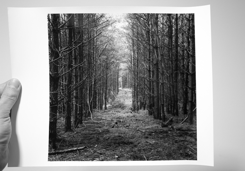
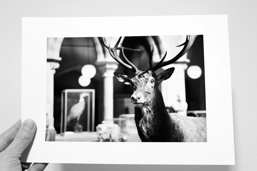
A warmtone darkroom print showing careful modulation of tone, with a strong main subject that is tonally distinct from its environment.

A warmtone darkroom print showing careful modulation of tone, with a strong main subject that is tonally distinct from its environment.

Traditionally, this involves keeping the subject (especially if a person) fairly light tonally (this catches the eye) and to darken surrounding areas, particularly edges, so as to create a frame. Darkened edges are known as a vignette. 

Yet further than this, it is important to make decisions about how to create a sense of contrast between the image zones. Perhaps a very light area of window light needs to burnt-in just a tad, so as to lend a little more solidity to it. Maybe an area at the end of a road in a landscape needs lightening to distinguish it from surrounding trees and to lead the viewer’s eye through the image. Perhaps a little collection of objects near the bottom of the frame is too light and competes with the subject that is more central. Knock it back with a gentle burn-in.

4. Shoot the zones

This exercise was devised by John Blakemore. It assumes some familiarity with the zone system, or, at least with the tones that are demarcated by it. Summaries of the zones and their corresponding descriptions abound on the internet, so one of these is a good place to start.

You begin by choosing a zone and attempt to make a photograph that encapsulates its mood. So, I might choose zone four, say, looking carefully at the tone given in the charts and mulling over the description I have found of ‘average dark foliage, dark stone, landscape shadow’.

The challenge with this exercise - and a challenge it indeed is - is that you are trying to make an image that still holds a range of tones, but that somehow summarises the feeling of the zone in question. You may of course use any development or printing controls you have at your disposal to make the print that you think is appropriate. There is no right or wrong to this, it’s simply a very good exercise for understanding the tonal range available to black and white photographers.

Excepting some of the lighter areas, in particular the cottage, this image strikes me as having something of a zone three / four mood.

Excepting some of the lighter areas, in particular the cottage, this image strikes me as having something of a zone three / four mood.

5. Make a ring-around

For this exercise I’m going to assume that you are using a film (and developer) with some regularity, and that you have a pretty well-established development regime.

You will need to shoot three rolls of film. Firstly, shoot your typical subjects at ‘box speed’ (i.e. the ISO as stated on the film box). For example, if you are shooting HP5+, you would go with 400. It does help to have one or two test subjects (e.g. a given room with consistent lighting) that will provide a reference point across the films.

Next, you shoot more of your typical subjects (re-do that test subject too) but this time at a stop under and a stop over that box speed. You might simply want to change the ISO on your camera, so that you can simply get on with shooting. Therefore, in my 400 speed example, I would shoot some frames at 800 and some at 200. It takes some discipline, but it’s really worth making note of all your exposures as you do this exercise.

When the films are finished you then develop them in the following way. For the first you follow the manufacturer’s guidelines for the developer in question. Opening up my box of HP5+ I find a handy chart which will tell me the time with the developer I'm using. For the next film you add 20 percent to the development time, so as to ‘over-develop’ the film. You may have guessed that for the remaining film you are going to reduce the original manufacturer’s time by 20 percent. This will give you ‘under-development’.

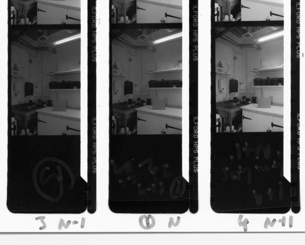
When you are done developing you make a contact print of the results, in your usual manner. In the following image you can see just such a contact print, here showing the ‘normal’ development, and what is labelled +1 and -1, meaning our +20 and -20 percent. I have asked you to do a lot of hard work so far, but already you have a lot of really interesting information. Do you prefer the manufacturer’s development time, or the over- or under-developed version?

Contact print showing 'normal' development (centre), under-development (left) and over-development (right)

Contact print showing 'normal' development (centre), under-development (left) and over-development (right)

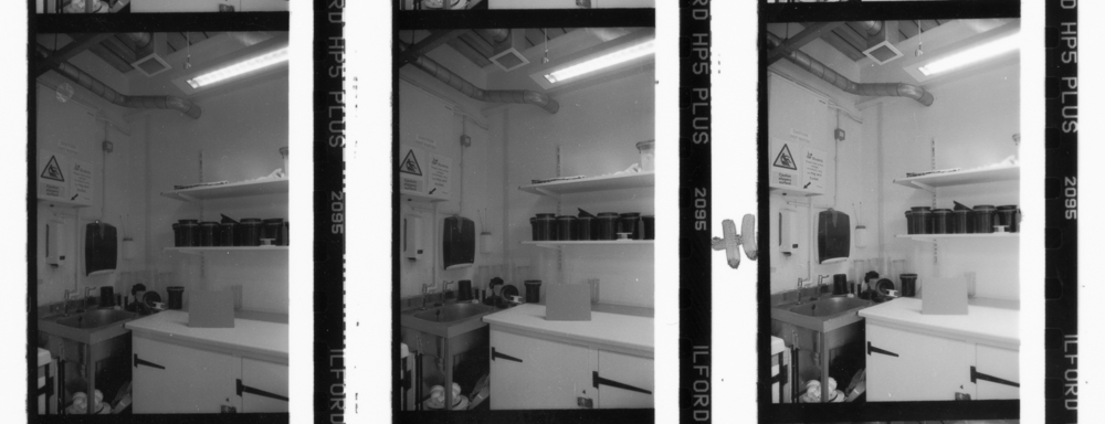
Next you can look for frames that you overexposed. What do you think of overexposure and underdevelopment? Or of overexposure and overdevelopment? Which tonality do you prefer? Here is my contact print showing overexposure. The development sequence is the same as the image above, so left under, middle normal and right over.

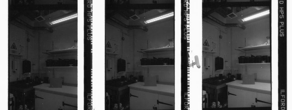
The underexposed frames then complete the picture. Again, which is the best tonality, for you and your typical subjects? What does the test scene suggest?

There is some more work to do, because this exercise can be brought to a brilliant conclusion. The last step is to print a selection of the images (logically you’d do nine, as suggested by the contact prints above) aiming for the best possible print in each case. In other words, you don’t print them all to some standardised time and grade, but make the best possible print using all the usual controls that are available to you.

You now have a huge amount of information about your shooting and developing regime and with luck some interesting new exposure and development settings to trial over a longer period. You are not stuck with whole stops or indeed 20 percent, but can make further refinements as you progress. Not a quick or easy exercise but potentially a very fruitful one.
 

Tone: a primer (post 4)

If you've followed this series this far, I thank you for your patience and hope you'll find something of interest in today's post. I plan to do one final post after this, a collection of practical exercises to help improve your command of tone. If you are tuning-in to this series for the first time, this post will make sense on its own, but I would recommend checking out the preceding ones in order to get the most out of it.

Recipes of tone

I turn my attention now to providing some examples, in order to show what ‘recipes’ of tone are available. The images are taken from my own practice; however I should add that the history of photography is brimming with examples from numerous different schools. We might think of Bill Brandt and the English School, the endless greys of Paul Strand’s Palladium prints, or the rich and varied tones of Group f/64.

Wide tonal range

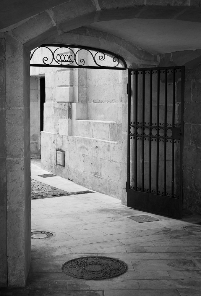
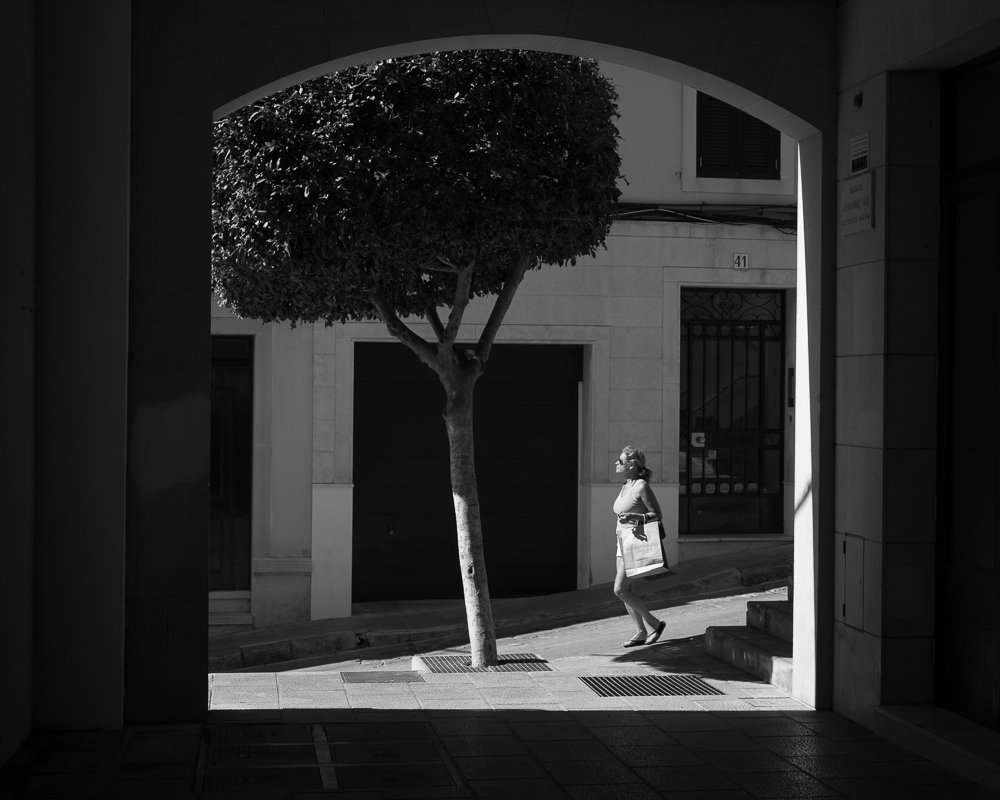
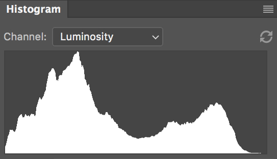
My first example is of a long tonal range, running from pure black, through a range of differentiated greys, and finally to very light grey, nearly white. This image is representative of what is often the default advice given to photographers, namely to ensure that their images contain multiple areas of distinct tone that can please the eye. The histogram looks like this:

A histogram is a graph showing the distribution of tones. The horizontal axis represents the different tones available, running from pure black on the left to pure white on the right. The vertical axis represents the quantity of pixels in the image it maps, so that the peaks indicate dominant tones. The benefit of a histogram is that it helps you to visualise tonal distribution without being fooled by the image itself. This particular histogram broadly backs up what I said about wide-ranging tone, but you will see that there is more to the story. More accurately, the peak on the left shows the image to be rich in shadow tones; on the right we see a smaller, but also significant, group of light tones. The histogram ‘crashes’ with the left hand side, showing that pure blacks are present, but is still a little way off white on the right. The lightest tones are therefore ‘nearly white’. We might therefore speak of an image that has a goodly tonal range in shadow areas and in the very light greys through the arch.

Pale tone with dark elements

The tonal approach or strategy in this image is to have a largely light image with a smattering of punctuating dark tones. The eye is therefore drawn to the darker areas, which in this case helps to support the inferred narrative.

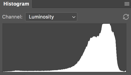
The gentle light greys of the background provide some substance, but because they fall within a certain portion of the histogram they don’t compete with the main protagonists. They contain subtle modulations of tone (and indeed there are some crisp near white points too) rather than being an undifferentiated mass of a single grey. They don’t interfere, but they are not flat and lifeless. The histogram looks like this:

We can see that the very dark tones are not quite black (although the seem like it to our eye), likewise there are very light greys and only tiny amounts of white. The majority of the tones are over to the right, as we would expect given our description.

High contrast

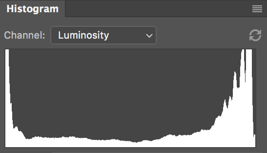
A high contrast image is one in which the darks and lights dominate, grey tones are largely or completely absent. This is a digital image, but were this a darkroom print, we would most probably be looking at a 3 or 4 contrast grade. The window structure is a near silhouette, and is black and very dark grey. The sky beyond has gone over to white. There are some more subtle greys from the middle of the scale in the building, but they take a minor role, as reflected in the histogram:

I am not a photographer who favours high contrast images, and I in fact struggled to find good examples from my archive. I gave this image a little extra contrast in order to provide the illustration here. Such an approach is a very graphic style which favours bold shapes and outlines. In film photography, high contrast leads to pronounced grain and is often associated with low light work with fast films, or average speed films that have been ‘pushed’ in development (exposed at a higher ISO than box speed, with compensated development to avoid negatives which are too thin).

As I searched for images I begin to wonder about my own photographic style and why I had made such little use of graphic contrast. Such thinking leads to interesting questions about habits and assumptions and whether we are not missing out on creative possibilities. Naturally, there is no rule that says one must be using all established approaches to tone in one’s work (life would be very dull if we all did). Yet I think there is a job of reflection that we can do given a knowledge of how tone works and what we haven’t tried. To paraphrase a master printer I admire, how do we know we don’t like the alternative if we haven’t tried it?

High contrast scene, exposed for the lights

This recipe entails exposing for patches of light tone in very high contrast situations. It is very fashionable at the time of writing. The photographer typically applies negative exposure compensation and allows the shadow areas to lose definition. It is like the high contrast approach above, inasmuch as it can be very graphical, but the crucial difference is that the favoured areas still potentially contain a wide tonal range. It is used mainly by street photographers and has the clear benefit of helping to establish areas of interest and narrative interaction. The photographer can make frames within the images, sometimes multiple ones, which connect and juxtapose the chance elements of the street.

Long, expansive greys

My final formula is one much exploited in the history of photography, and that is of a fulsome range of greys. The idea here is to have midtones that reach outwards such that a harmonious scale of differentiated tone is apparent. The photographer tries to maximise tonal information, downplaying, but not eschewing, the extremities, whilst maintaining tonal transition and modulation. Black and white aren't entirely absent, but they do not present themselves as much as in the 'wide tonal range' recipe with which we began.

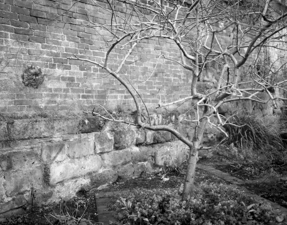
The histogram for tree image above shows abundant midtones invading the space to the sides. There is a huge amount of tonal information here and the photographer has to take care not to let the image appear too muddy.

The histogram for tree image above shows abundant midtones invading the space to the sides. There is a huge amount of tonal information here and the photographer has to take care not to let the image appear too muddy.

Platinum / Palladium prints are notorious for providing a tonal recipe like this. The don't exactly lack contrast, and certainly not tonal differentiation in a good print, but the scale of grey just seems to go on and on. I don't think it's an accident that the example I've chosen from my own practice comes from a 5x4 negative. Large format has an inherent ability to capture smooth tonal transitions, in no small part due to the sheer size of the negative and the information captured. Tones still need to be managed, of course, through exposure, developer choice and development and dodging and burning, but the photographer is in a strong position to achieve the effect to begin with.

My example was shot on Ilford Delta 100 Professional film and developed in LC29. Delta 100 is extremely fine grained in large format, and LC29 gives wholesome contrast without becoming overpowering. With a negative like this, one can dodge and burn gently to tease out distinct areas of tone, emphasising the range at one's disposal and avoiding 'muddiness'.

Indeed, avoiding a mass of undifferentiated tone is the key challenge in pursuing expansive greys. With such prevalent midtones it is easy to lose a grip of contrast. An image of expansive greys still needs to be tuned with gentle modulations of tone to provide a story and a journey for the eye. Too many similar tones will quickly repel the eye and return a feeling of flatness. The photographer must find subtly and tonal richness without relying on more familiar devices of contrast and distinction. As with so many different photographic media and techniques you can't have it all ways and have to work within the set of compromises you have chosen. 

Next instalment: Games to play (the exercises)


Tone: a primer (post 2)

Welcome to post two in my blog series introducing tone in black and white photography. If you haven't already done so, you might want to check out the first instalment. You can navigate to it using the menu on the right or the search box above it.

Here's today's instalment.


A sliding scale of grey
Imagine a continuous line of tone that stretches from black, through every conceivable grey, and arrives at pure white (which is often in practice simply the ‘colour’ of our paper, minus tone). We can make a visual representation of this using software:

From black to white - an imaginary line of every tone

From black to white - an imaginary line of every tone

Photographs can be made up of predominantly one tone, e.g. very dark grey, or they can contain a staggeringly wide range. There is no a priori rule that says photographs must contain certain tones, where on this scale tones must come from, and in what combination they should be seen. However, we do have a good deal of precedent regarding what works well in a given situation. As ever in art practice, rules of aesthetics can sometimes be broken.

The scale above hints at an infinite scale of grey, at least theoretically. This tells us of the beauty and flexibility of black and white. It is an incredibly subtle medium, which looks deceptively simple. I liken this for my students to the keys on a piano. You can ‘get’ that they produce a series of notes, even if you are not a musician, but making actual music from them - putting them together in a certain order, with the right timing - is something else. In isolation tones are as characterless as a single note, but in combination they are there to be ‘played’ and made to sing. 

Now, it is not very practical to refer all the time to an infinite scale of grey, even if that is what an analogue medium can potentially produce. So in photography it is customary to divide the tones into a series of ‘zones’ that are a stand-in for more subtle and complex groupings. The zones help us to specify the areas of tone we mean, and perhaps more importantly can be related to the practical business of exposure. Exposure is essentially how light or dark our image turns out, and is determined by the amount of light we ‘expose’ our film or sensors to.

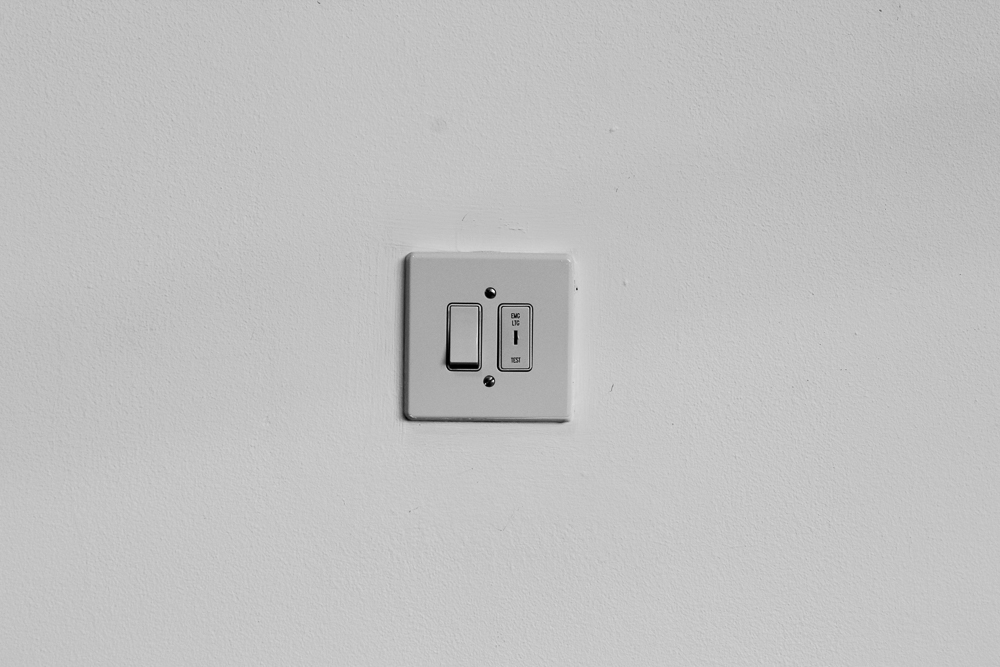
Let’s do this practically. Were I to point my camera at a white wall and let the meter determine the exposure settings I would get something like this:

Let us say, for the sake of argument, this is 1/250, f11 at ISO 400. (If you don’t know what these numbers mean, now is the time to look them up, or make a mental note that you need to come back to them in a little while.) You will observe that the tone I’ve created in my photograph is in the middle of the range. This is because light meters in cameras are calibrated to produce a ‘middle grey’ (there are some nuances and complexities to this, complicated by contemporary metering systems, but that is for another article).

So let’s say I am unhappy with this result and want my photo to look more like a white wall. I can do this by adding more exposure:

I used the same settings as above, but this time changed my aperture to f5.6. That’s two stops more light entering my camera, and two stops up the scale of zones. Sometimes this is referred to as ‘over exposure’ (i.e. too much exposure), but I hesitate because I’m preaching that there is no absolute right or wrong in this. If you want your wall to look this way, this is the exposure you choose.

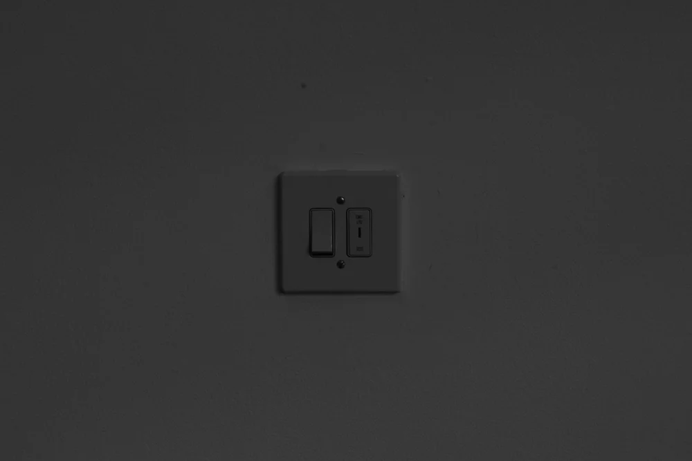
Let’s now complete the set and produce a dark version: 

This time I changed my aperture to f22. My world has gotten darker, the mood is more ominous.  

While the example of the wall shot underlines the direct relationship between tone and exposure, it is an undeniably simple case. It’s not quite true that we are dealing here with single tones that equate to zones, because the images will actually be made up of some quite subtle fluctuations of grey within a zone region. However, you will see that we can use the zones as a useful way to categorise our shots, in which groups of tone do indeed dominate. We can put this is in an even simpler way by using the more common categories of shadows, midtones and highlights. You may have come across these in software (e.g. Adobe camera RAW, or Lightroom), or in general discussions of photography.

Next instalment: contrast & dodging and burning


Tone: a primer

A happy new year to all my readers!

Well, 2017 is here and I'm happy to announce a little series of blog posts I shall be making over the coming weeks on tone in black and white photography.

I shall be writing these posts with a view to offering a primer on tone, something for the beginner, for sure, but hopefully of interest to the more experienced photographer too. As well as making some essential definitions, I shall be considering ways in which tone is of crucial importance in black and white photography, looking at ways it can be manipulated, and examining typical contrast 'recipes'. I will end with a series of exercises, a little tonal work out if you like, aimed at giving anyone who follows them a deeper appreciation of tonal values.

A rough schedule is as follows:

Post 1 (today): Introducing tone

Post 2: A sliding scale of grey

Post 3: Contrast & dodging and burning

Post 4: Recipes of tone

Post 5: Games to play (the exercises)

Please, as ever, your feedback and comments on the posts are welcome. As hinted at above, you'll find the first post immediately following this one.

Be a better photographer - tip 10

You don’t make a photograph with just a camera. You bring to the act of photography all the pictures you have seen, the books you have read, the music you have heard, the people you have loved.
— Ansel Adams

Train your visual memory

I believe in creativity, but I also believe that we learn a social language ‘through’ which we speak. As it is with words, so it is with photography. Adams puts it economically when he says that ‘you bring to the act of photography all the pictures you have seen’. Photographers learn photography by learning to speak its language. That language is made up of the work that has gone before us, the grammar, so to write, established by those who find their way into a culture’s visual memory, passed on through books, museums and latterly the web.

Just as a writer might conjure an original feeling or sentiment using the established words, phrases and literary devices of the past, so a photographer aims to carve out a niche in picture-making. Literary minds are nourished by the traditions of literature on which they draw and are immersed. The same goes for photographers. I am not so much of an expressionist as Adams, and maybe the full quote above is unfashionably romantic. However, I think we would not be off the mark to read Adams’ as an educational message to look carefully and widely at good work by others, in order to improve our practice.

So my tip for the day is to consider the wonderful photography of the past as great works that we can read to improve our photographic eye. If you have seen good photos, in other words, you will stand a better chance of drawing on them to make good work. Give time and space in your engagement with photography over to careful looking and contemplation. Galleries and museums are great because we are in the physical company of the work and peruse with minimal distraction. Books are tactile and inhabit our living environments, such that we spend more time digesting a photographer’s oeuvre. Numerous times have I chanced on a photographers monograph from my bookshelf and re-awakened my engagement with the work. Such images stick around, literally and in the mind.

Sure, we might start off being under the spell of great photos, feeling like we’ve made another ‘Adams’, say. Yet given enough time and a generous diet, we might come to put that ‘language’ together, in fresh and contemporary ways. It’s an essential part of learning to be a better photographer.