If you read my prior post you'll know this gallery has come about thanks to a whimsical call for photographers to confess with me an obsession for trees. Credit must be given to @EMULSIVEfilm and @AukjeKastelijn who were party to the original conversation. They do, however, take no responsibility for the gallery that follows, and the editorial choices and omissions are mine.
The response to the call has been quite amazing. Some very fine work has been shared, unfortunately more than I am able to include here. I clearly did, however, feel it was a pity not to give at least some of the work a home, hence this gallery. I have set aside more images for a 'Part 2', so watch this space.
I hope you enjoy the gallery.
Dustin Veitch, First Light August 2016, Ilford FP4+ film developed in Kodak HC110 1+100.
An ethereal atmosphere dominates Dustin's black and white image. The play of light and shadow has an intangible quality, as if we could be looking at multiple exposures.
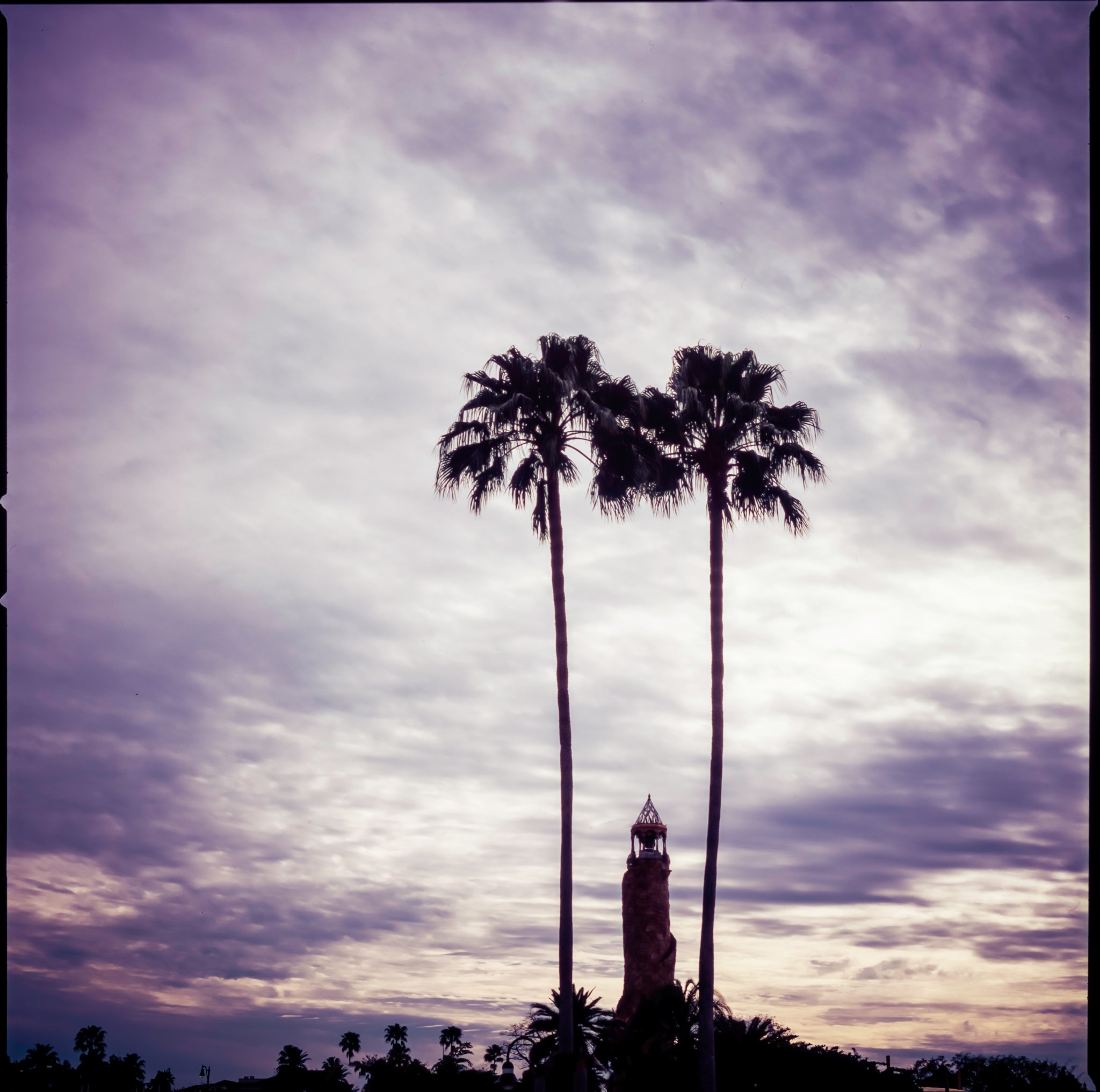
Ribnar Mazumdar, The Sentinels, Fuji Veliva 50 film.
A colourful sky pervades Ribnar's image, but it is the play of scale that intrigues me. How big are the two dominant trees? The tower in the middle? The tiny trees at the bottom of the frame? A great use of composition and scale.
Matt Parry, Glowing Green, Provia 100f film.
Matt's image has a strong graphic structure punctuated by the delicate, back-lit emerging leaves. A contrast of the old and immutable trunks, and the young, delicate regrowth.
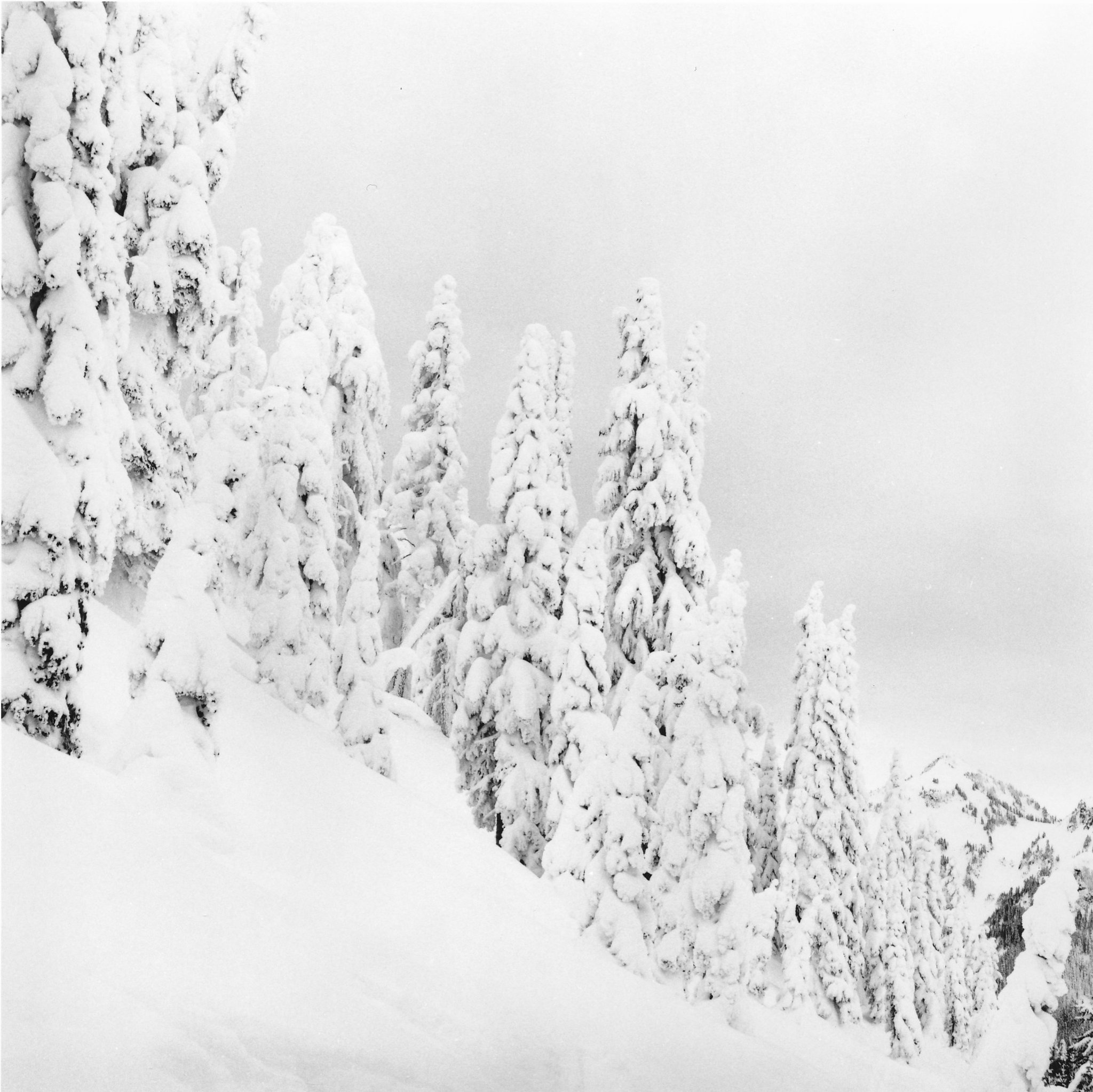
Monika (@DrMarsRover), Silence, Paradise, Mt Rainier, Ilford HP5+ film.
In this near monochromatic image by Monika, trees take on the disguise of fallen snow. There is a palpable sense of the weight of the snow and the resistance put up by the unyielding trees. The strong diagonal from top left to bottom right visually reinforces this exchange of forces.
I particularly enjoy the crisp, shape-defining light in this neatly composed piece by Barnaby. The details are fine and the tonality expansive.
You can find more of Barnaby's work over at his website. Click his image above for the link or go to barnabynutt.com.
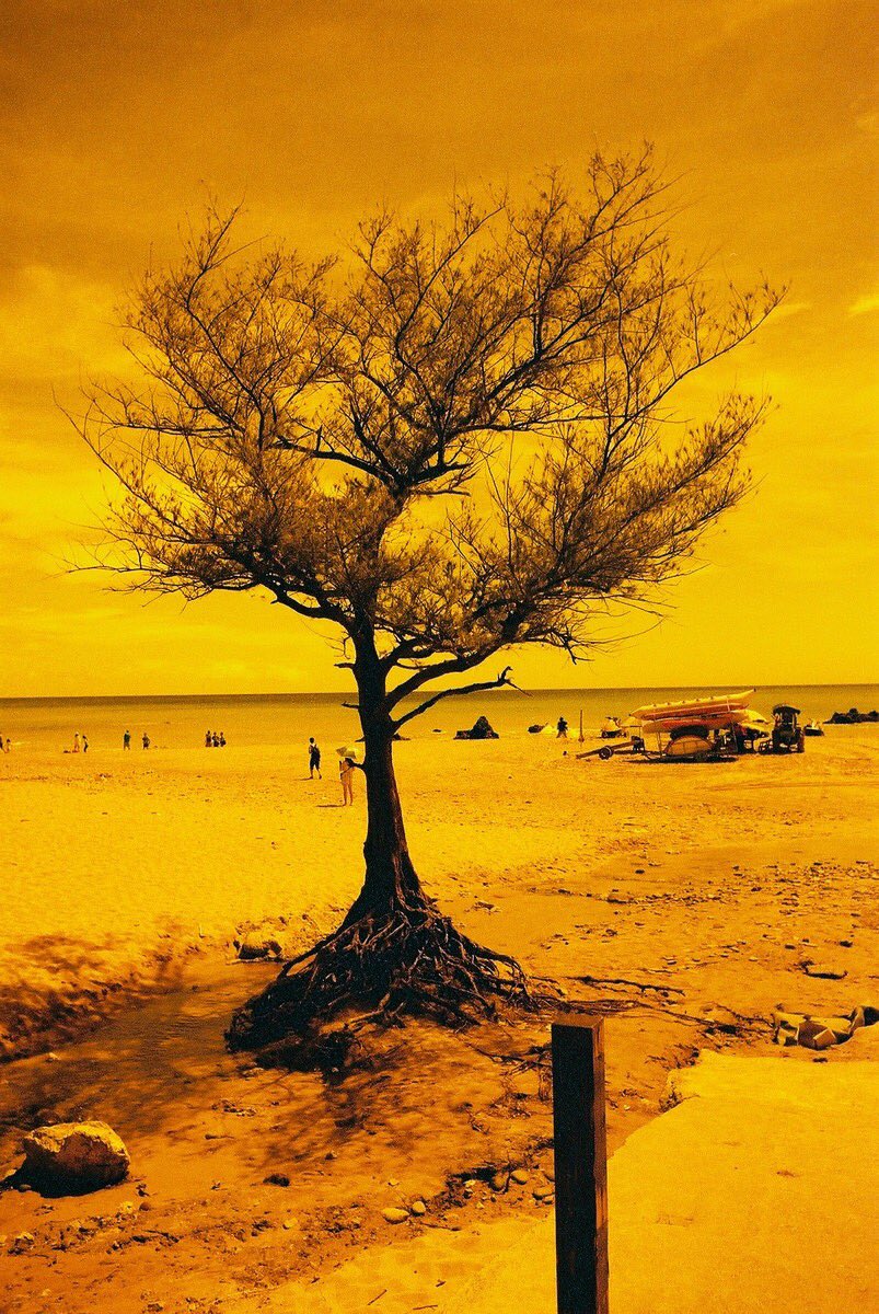
Emulsive (@EMULSIVEfilm), Kodak ULTRAMAX 400 film shot at EI 25.
Emulsive's submission seemingly hails from another planet. It was born through experimentation, specifically pre-heating the film before development, that resulted in the strong colour cast. The treatment somehow suits the character of the tree, its shape and demeanour.
Nick Trujillo, Lone Cypress, Pebble Beach, CA, Fuji Reala 100 film, developed using an Arista C-41 kit.
The choice of film and development have undoubtedly played a role in Nick's fine image. There's a relationship between colour palette, format and subject matter that sings to my eye. I also admire the careful framing - it can be really hard to manage the closer elements in such shots from afar.
Philip Constant, Two Trees, Santiam Hills, Ilford Delta 100 film, lab developed by Ilford USA
There is a poetic simplicity to Philip's image, an emptiness, and yet a dialogue. The two trees stand separate (and are compositionally in danger of becoming unrelated), and yet they feed-off each other, two central characters in some undisclosed drama. The tonal key is just right, and clouds both lend interest to the sky and bridge the central divide.
Thank you for looking, and I hope you enjoyed the work as much as I did. Please do look out for the second instalment, coming soon.


