So far in this series I have given a general introduction to tone (in black and white photography), and have introduced the idea of using exposure to gain creative control over general tone and mood. It's well worth looking over the previous two posts if you are new to the series.
In this instalment, I turn my attention to the concept of contrast and introduce the idea of local adjustment of tone.
Contrast
Contrast is nothing more or less than how tone is distributed in a photograph. In high contrast images, it is the extreme ends of the scale that dominate. Low and high zones, or shadows and highlights, are evident at the expense of midtones. Conversely, in low contrast images it is the midtones that dominate, the more extreme zones being largely absent. A more typical scenario is a scene containing a wide range of tones, and therefore more moderate contrast.
Left to right: low, moderate and high contrast
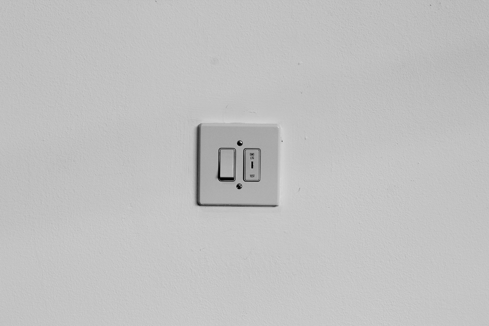
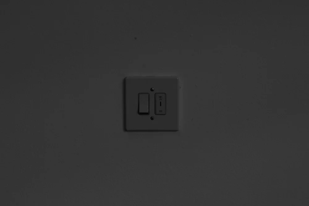
Life for photographers isn’t always easy, and when thinking about contrast we have to keep an eye on how our materials effect contrast as well as the contrast from the original scene photographed. My wall example (see post 2) is straightforward in the sense that it is low in contrast. However, as we have already hinted at by looking at some different exposures, it can be rendered in different ways depending on our use of the medium. Indeed it shows a classic problem in black and white, which is that white things will usually be rendered grey unless we do something about it using our technique.
‘Overall’ contrast (or more properly ‘global’ contrast) isn’t the whole story when it comes to manipulating tone, as we shall see, but for many practical reasons it is an appropriate place to start. In addition to exposure, film development, paper choice (including the contrast grades), software processing and even viewing distance affect contrast (try observing how contrast increases the further away you get from a photograph on a wall). Each of these areas is a subject deserving treatment in its own right, but some examples will give us a taste of the choices that need to be made.
Films interact differently with different developers and this affects contrast. How the developing tank is handled (agitated) effects contrast, as does development time (extending development gives more contrast, cutting it less). Papers have different ‘grades’ corresponding to the high, low or average contrast set out above (with ratings going from 00 to 5). Some darkroom workers still use papers with ‘built in’ grades, however the majority now use ‘multigrade’ paper capable of rendering all the grades through the use of filters.
A modern variable contrast enlarger. Changing contrast is easy thanks to the contrast dial (yellow dial, centre of picture)
Papers also have intrinsic leanings to different distributions of tone, some have more midtone contrast, others more contrast in the highlights, and even paper developer can be mixed at different strengths to increase or reduce contrast. Different image processing packages put their own stamp on how images are initially processed and the contrast that results. RAW developers offer a staggering amount of precise control over tone, printer drivers can affect contrast, as again does paper, this time in the inkjet world.
A series of reference prints from a step wedge. These show the differing tones a given paper has to offer at different grades. They can be a real boon to a darkroom worker.
Not only are there lots of factors influencing contrast, they also work subtlely in tandem. A given paper can only print a given negative, in which a series of decisions about contrast has already been made. The same is true with digital processing, although thanks to developments in technology, it is increasingly the case that image files can have their contrast adjusted significantly in post-processing (without any penalty for poor or inattentive exposure technique).
This takes us to the question of the original scene again, still a big issue for film photographers. A ‘typical’ scene, let’s say one including sky and land on a bright day, will contain a tonal range that comfortably outstrips film’s ability to record it. This means in practice that a photographer must decide where to place the exposure, and compensate for the problems through development and printing. This forms the basis of the zone system mentioned previously. The photographer exposes to achieve adequate detail in the shadows and then controls the highlights by reducing or extending development times.
Dodging and burning
We have now established two substantial ways that we can take control and determine the tones in our photograph: exposure and materials / technique. Control is the aim, ultimately, for we cannot ‘play’ our tones if we cannot purposefully manipulate them. The remaining method at our disposal is the altering of individual areas in the photo, traditionally known as dodging and burning. A darkroom worker dodges, or shields, areas of paper as a print exposure is made in order to create lighter tones. Burning-in is the opposite, in which tone is added to a distinct region using further exposure and a piece of card with a hole in it (or more simply the printer’s hands, shaped to make a hole for the light).
Dodging the print under the enlarger light using a simple card dodging tool
The language of the wet darkroom was adopted by software, and hence we have dodging and burning tools in digital processing too. The methods for altering individual areas of tone are now numerous: as well as the aforementioned tools themselves, we have masks and levels adjustments, adjustment brushes in RAW processors, layer styles and layer masks, control points, the list goes on. Increasingly, an analogue print from the traditional darkroom feels like a handmade ‘event’, which cannot precisely be repeated, whereas the digital darkroom is all about absolute precision and repeatability. I really enjoy how I can revisit a print in software, making very fine adjustments as I progress the work. I find myself working somewhat differently in the darkroom to the digital realm because of this.
In my experience, a modest amount of dodging and burning is all that is usually needed to turn a ‘good’ image into something much more special. The challenge is to be able to determine what an image needs, and to make adjustments without over-doing them. That said, it is often surprising just how far we can alter the tones of an image before the eye begins to protest and it looks unrealistic. Assuming that halos or other obvious signs of intervention aren’t produced, our minds will accept quite extreme tonal combinations, at least in black and white photography.
Next instalment: recipes of tone


