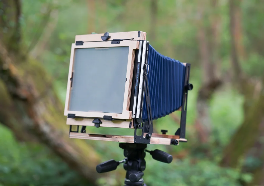
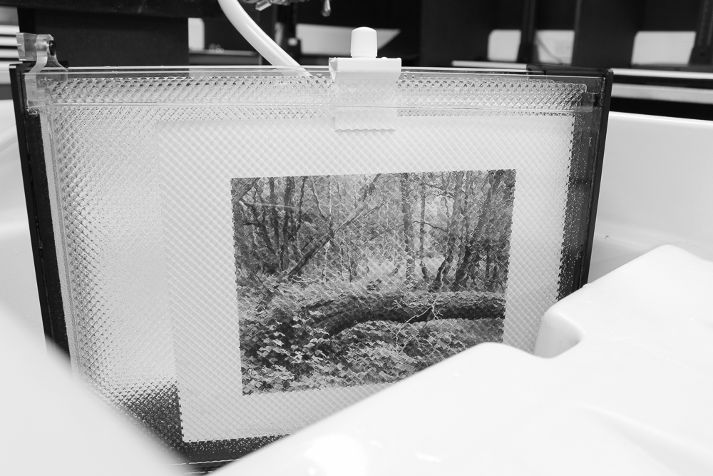
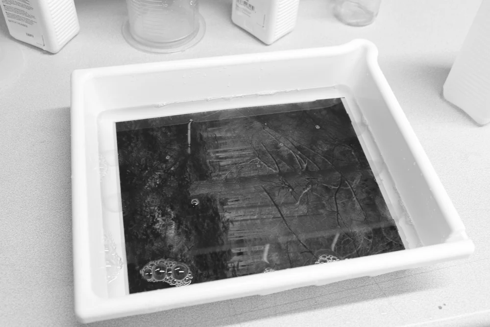
I have become increasingly aware of a little problem in my work on 5x4 of late, and it is, amongst other logistical issues that come with 5x4, a reason why my large format adventures have stalled somewhat. I’m still very much in the early stages of my work with the format, beginning to learn the craft, feeling my way, and asking myself how I will ultimately use it - assuming I continue in the longer term.
It is part of my photography philosophy that an outcome must be determined for a particular process. The ultimate form the image will take determines camera choice, development, digital processing or whatever. If this is a print - and it mostly is for me - the desired dimensions, paper choice, whether it is darkroom or digital, will clarify, and to some extent dictate, the workflow that leads to it. I see too many people who put the cart before the horse: they spend hours researching and pondering their ideal camera, and yet show little or no awareness of the kind of image they wish to make.
When one studies the results of one’s workflow, a cycle of reflection develops and information fed back to the shooting stage. This is a key ingredient in the craft of photography: the photographer is able to visualise the finished image even before the shutter is pressed. More practice with a given workflow leads to more technically refined images, which in turn leads to a more fluid expression of artistic ideas.
So onto my issue with 5x4. The nub of the matter is that I don’t have access to a 5x4 enlarger, and so can’t make a darkroom print. I have made contact prints of course, but this is not the goal for me (and I would wager for most people using 5x4, the negatives just make prints that are too small). 10x8 would be a different matter, but 5x4 wants to be enlarged. Why else are we shooting 5x4 if not to make big prints? There may be some residual and aesthetic properties flavouring the scanned image when looked at side by side with a digital counterpart, but it is hardly night and day. If I’m going to the trouble of shooting 5x4, I want night and day.
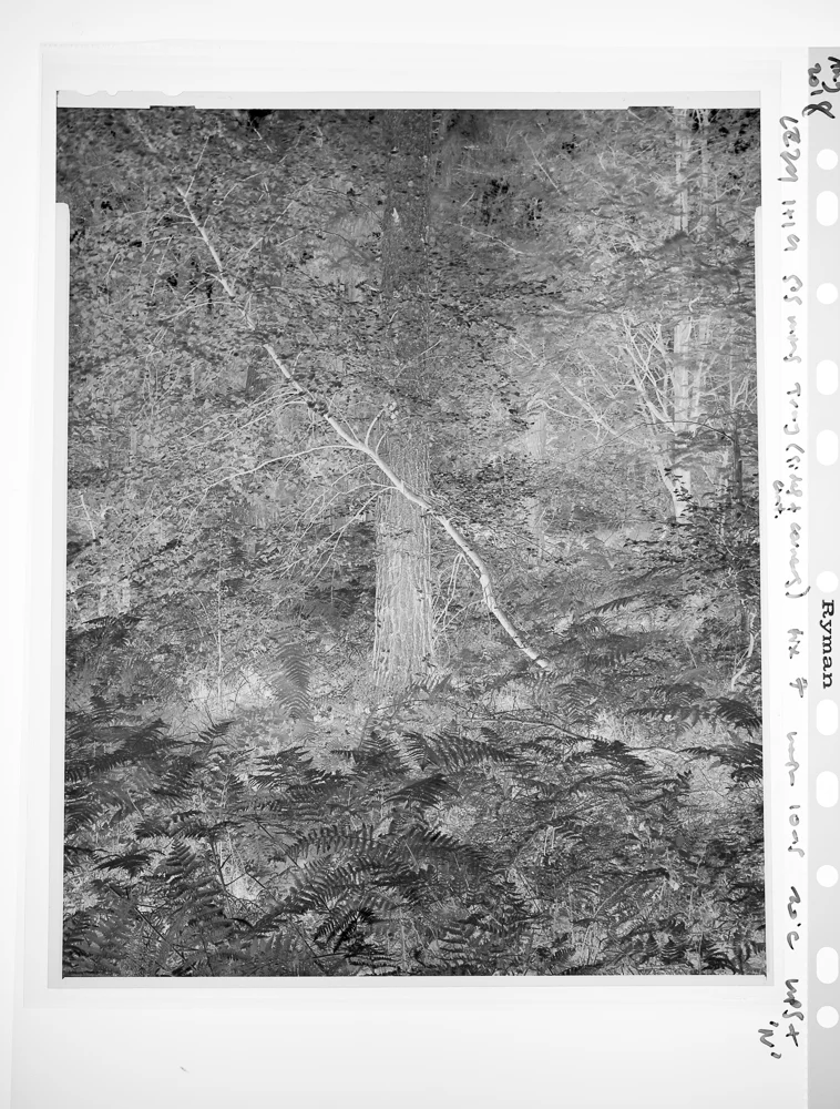
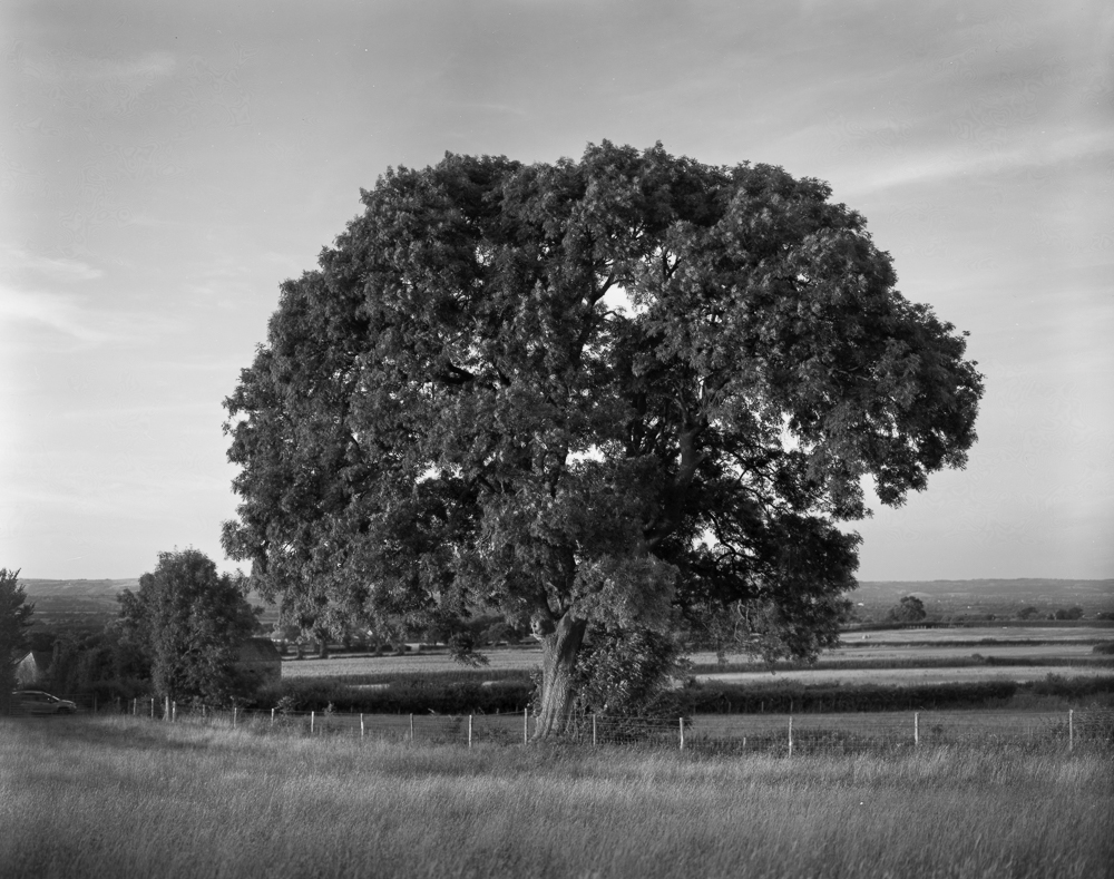
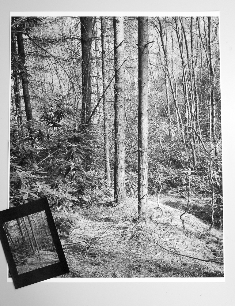
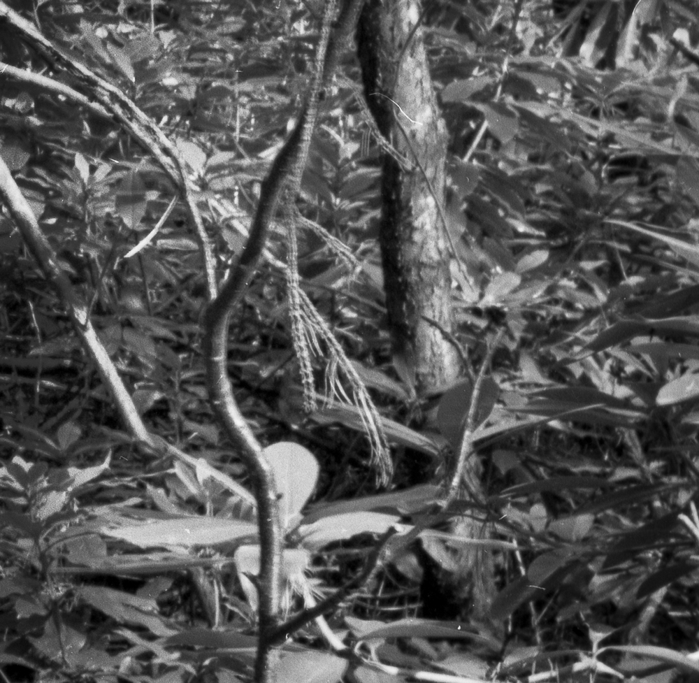
The image above shows a step towards solving this issue, albeit it entails a digital pathway rather than a silver one (which does inevitably make the unrealised darkroom print my elephant in the room, for now). I had the negative in question scanned by a lab to make an impressive 281 mb file. That is approximately 93 megapixels of information. I prefer to print my own images wherever possible, due to the control of the workflow I have already referred to. I would, however, out-source a large print providing I had been able to work on and study small sections first.
Please forgive the somewhat crude use of two sheets of paper to make the image. They are simply placed side-by-side to make the larger print, and hence to get a sense of the scale of the image (you can see the join, and they are slightly out of register in the photo). I have included the contact print for scale. Now, I will leave aside the issue of what constitutes a ‘big’ print, because, as ever, such things are relative. For some practitioners the size shown here is hardly big at all. However, in my own practice, in the making of the kinds of fine print I enjoy, with the detail and tonality that I usually covet, this is a big print. To use a phrase that once had a pejorative slant, I want to be able to ‘sniff the print’. That is, I want the detail to hold together on close inspection. (Detail is a function not just of print size, but viewing distance too. The received wisdom is that prints need not be so detailed as they get bigger because the viewer will be further away, if the whole is to be seen. I want my viewer to be able to ‘step in’ and look at a section close up.)
You will see that the subtext here is that 5x4 does indeed provide a means of providing the kind of large print I envisage making (others will not be surprised, but, given my philosophy of seeing for myself, this is besides the point). Even in its somewhat improvised state - and I have only processed it to a limited extent too - it is an impressive thing. There is no sense of the tonality ‘running out’ that you sometimes see with 35mm enlarged too far. There is hardly any visible grain at all (the negative is Delta 100 developed in Perceptol). The central trees offer a clear structure to the ‘overall’ image, and yet, as a somewhat busy image, there are lots of little episodes and separate dioramas to enjoy.


