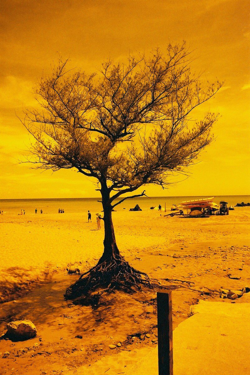
This week I'm pleased to present #TreePhotoGallery, Part 2.
In Part 1, I gathered together a fine selection of tree photographs by photographers on Twitter. The quantity and quality of submissions following my original call for work was so high that I promised a Part 2 - a promise I happily now keep.
I hope you enjoy the work.
Tom Rayfield, Walk The Faded Line.
Tom's delicate piece cocks a snoot at the notion that central placement is to be avoided. The tonality is stunning: it allows the tree to be 'just' emergent; the viewer continues to do a double-take as the tree shimmers like a grey mirage. There is a tonal lesson too: the range is constrained in the middle values - but just look at its effect! Leading lines are at work from the bottom and the sides.
Matias Takala (@elfsprite), Lone Pine, Ilford HP5+ film.
Matias' image works on so many levels. What a fine juxtaposition of the vulnerable tiny growth in the foreground and the expansive water and forest behind. A successful landscape image so often stands or falls on the foreground-to-background relationship. Matias' image is a great example of how to get it right.
Analoguephotolab (@analogue_photo), Orwocolour NC19 film.
I enjoy the pale tonality and somewhat humanoid-like posturing of Analoguephoto's trees. It's shot on Orwocolour, a film with an interesting history and idiosyncratic colour palette. I haven't tried it, but from what I've seen I imagine it isn't a film for all occasions. It's an excellent choice here.
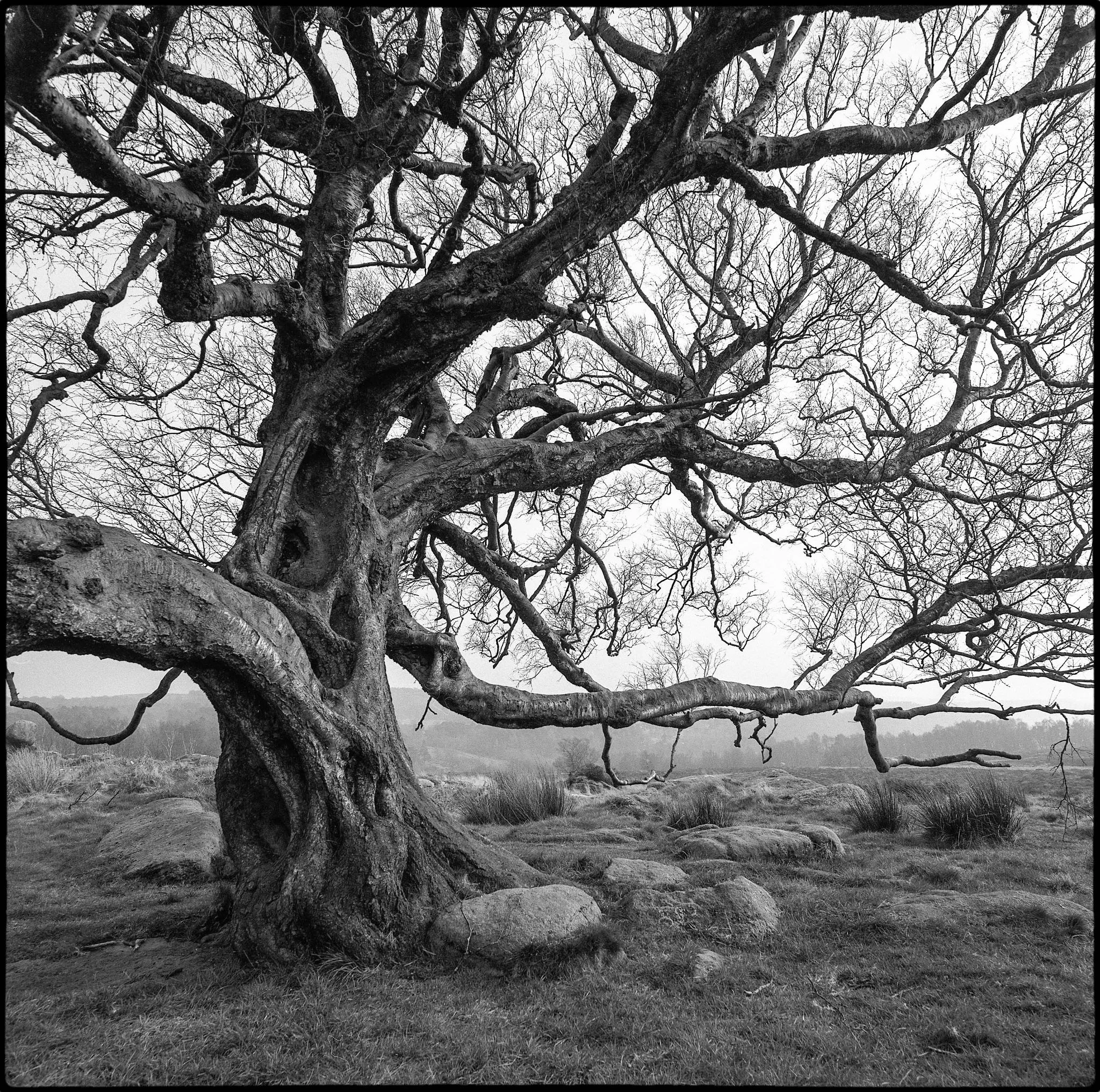
Adi Taylor, Twisted, the Owler Tor Tree, Ilford Delta 100 film.
Great photos take great subjects and add photographic magic. That's exactly the case with Adi's image. Not only is the tree itself brimming with visual interest, but Adi's treatment adds fine tonality and careful composition. The square format can be quite a challenge, but here it reinforces the tree's stocky, powerful form.
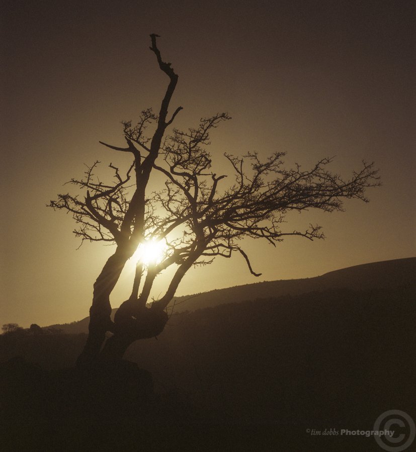
Tim Dobbs, A Tree At Sunset, expired Fuji NPS 160 film.
Some photographs have the power to awaken senses other than just your vision. Tim's monochromatic piece does that for me: I sense a whiff of the early morning fresh air; or the cool rush of the day's end. The sun is carefully positioned, its light breaking through the branches just above the horizon. Like Tom's image above the tonality is subtle, and gives away more as the eye delves deeper and gets accustomed to the lower darkness.
Lina Forrester, Afternoon, freelensed with a 50mm lens and a Nikon D5300 camera.
A clever use of freelensing by Lina conveys the impression of wavering branches and fragile flowers in this poetic black and white photograph. It has something of a dream-like quality, a moment glimpsed but somehow not quite fixed, as a photograph should. Transience is key.
Sandeep Surmal, Southbank, London, Ilford SFX film with Infrared R72 filter.
I see so many infrared images in which the effect itself is dominant. They seem to say first and foremost: 'look how infrared transforms our visual world'. Sandeep's image uses the infrared effect, for sure, but it does more photographically, because the effect is in the service of the photo, not the other way around. With their leaves transformed, the trees mirror the lamp posts, leading our eye down the Southbank promenade. The partly ghostly people on the left add a lovely visual punctuation mark.
Lucy Wainwright, Fuji Superia 400 film.
Lucy's image is one which reminds me why I enjoy shooting film so much. It's hard to put into words, but the medium, with its bluish cast and gritty grain, add a gravitas to the struggle of the stalwart, gnarly tree. It's an image of survival: of steadfast resistance in the face of nature's unforgiving side.
A fine image to end a fine collection.
Here's a quick link to #TreePhotoGallery, Part 1 in case you missed it.
If you enjoyed my post, you might like to subscribe to my site here.
Purchases made with Amazon following the links on my site help me cover costs for posting the content I make. I get a small commission from Amazon at no extra cost to you. Alternatively, you can donate directly here. Thank you for your kind support!


